WPF
介绍
WPF(Windows Presentation Foundation)是微软推出的下一代桌面应用程序开发技术,用于构建在 Windows 上运行的富客户端应用(Rich Client Applications)。
它首次随 .NET Framework 3.0 于 2006 年发布,并在后续版本中不断完善。
WPF Demo 地址:https://github.com/chenrui1996/WpfDemo
WPF与Electron
| 对比 | WPF | Electron |
|---|---|---|
| 开发语言 | C#, XAML (.NET) | HTML, CSS, JavaScript (Node.js + Chromium) |
| UI 描述方式 | XAML | HTML + CSS |
| 技术栈 | .NET Framework / .NET Core | Chromium + Node.js |
| 平台支持 | Windows(原生) | Windows / macOS / Linux(跨平台) |
| 性能 | 高性能(原生,DirectX 渲染) | 较低(嵌套浏览器,内存消耗大) |
| 启动速度 | 快 | 慢(需要加载整个 Chromium 引擎) |
| 内存占用 | 较低 | 高(100MB 起步) |
| UI 自定义 | 强(基于样式、模板、矢量图形) | 也强(HTML/CSS 灵活) |
| 生态 | .NET 生态,NuGet 包丰富 | Web 生态,NPM 包丰富 |
| 调试工具 | Visual Studio 调试器 | Chrome DevTools、VS Code |
| 部署体积 | 小(几十 MB) | 大(通常 >100MB) |
| 开发门槛 | 需熟悉 C#/XAML | 需熟悉 Web 技术栈 |
注意
Prism 2023 年不再是完全开放的 MIT 协议项目
推荐使用 CommunityToolkit.Mvvm
基本用法
创建 WPF 应用
代码分析
一个 WPF 空应用 由以下几个部分组成:
MyApp/
├── App.xaml            --> 应用入口,资源字典、启动窗口等配置
├── App.xaml.cs         --> App.xaml 的后台代码
├── MainWindow.xaml     --> 主窗口 UI 定义
├── MainWindow.xaml.cs  --> 主窗口逻辑
App.xaml
<Application x:Class="MyWpfApp.App"
             xmlns="http://schemas.microsoft.com/winfx/2006/xaml/presentation"
             StartupUri="MainWindow.xaml">
    <Application.Resources>
        <!-- 应用级资源,如样式、模板 -->
    </Application.Resources>
</Application>
解析
<Application>:App.xaml文件的根元素,它定义了 整个WPF应用程序的全局资源、启动配置和事件绑定。x:Class="MyWpfApp.App": 指定当前 XAML 文件对应的后台代码(.xaml.cs)类名与命名空间。xmlns="http://schemas.microsoft.com/winfx/2006/xaml/presentation": 指定默认命名空间,WPF 控件的 XML 命名空间地址。命名空间:
XAML 使用 XML 命名空间(xmlns)来引用 CLR 类型。
这个地址虽是一个 URL,但它并不会请求网络,而是被映射为 .NET 类型库。其他页面的命名空间类似。
常见命名空间:
前缀 命名空间地址 说明 (无前缀) http://schemas.microsoft.com/winfx/2006/xaml/presentationWPF控件默认命名空间 x:http://schemas.microsoft.com/winfx/2006/xamlXAML语言关键字(如x:Class、x:Key) 自定义前缀 clr-namespace:MyWpfApp.ViewModels引用自定义 .NET 命名空间
StartupUri="MainWindow.xaml": 设置 StartupUri 启动页面。(也可以在App.xaml.cs创建MainWindow实例启动,甚至可以使用依赖注入启动。)<Application.Resources> </Application.Resources>: 注册全局资源字典(ResourceDictionary)如样式、模板。
提示
除命名空间声明, XAML 和后台代码绑定之外,Application 大多数功能都可以在代码中实现或替代。
实践中推荐:
- 使用
MVVM / DI容器管理页面时, 可以完全移除 StartupUri,转为在App.xaml.cs中OnStartup()里手动加载窗口。 - 推荐使用资源字典等
UI样式, 保留Application.Resources在XAML中配置。
App.xaml.cs: App 类是继承自 System.Windows.Application 的,表示应用程序的入口点。可以通过重写 Application 类提供的一些方法或事件来控制应用的生命周期、异常处理、启动逻辑等。
常见可重写的方法(virtual)
| 方法名 | 说明 |
|---|---|
OnStartup(StartupEventArgs e) | 应用启动时触发,在 MainWindow 显示前调用。可设置主窗口、自定义启动流程。 |
OnExit(ExitEventArgs e) | 应用退出时触发,用于释放资源、保存设置等。 |
OnStartupNextInstance(StartupNextInstanceEventArgs e) | 单实例应用再次启动时触发(需额外设置)。 |
OnActivated(EventArgs e) | 应用程序激活时调用(如被 Alt+Tab 激活)。 |
OnDeactivated(EventArgs e) | 应用失去焦点时调用。 |
OnSessionEnding(SessionEndingCancelEventArgs e) | 系统注销或关机前调用,可取消关机。 |
OnDispatcherUnhandledException(DispatcherUnhandledExceptionEventArgs e) | UI线程未捕获异常处理(推荐捕获崩溃日志)。 |
MainWindow.xaml: 默认的主窗口 UI 定义(界面)- 常见标签与属性:
区域 说明 <Window>主窗口的根标签(继承自 System.Windows.Window)x:Class指定该窗口绑定的后台类( MainWindow.xaml.cs)xmlnsXAML 命名空间(标准 WPF 控件库) xmlns:xXAML 标准命名空间,用于指令(如 x:Class,x:Name)xmlns:local自定义命名空间(项目内部类引用) Title窗口标题 Height/Width窗口大小 MainWindow.xaml.cs: 主窗口逻辑代码- 常见可重写方法汇总(主要来自其基类 System.Windows.Window 和其上级 ContentControl, FrameworkElement, UIElement 等):
方法名 作用 何时调用 OnInitialized(EventArgs e)窗口初始化时调用 调用 InitializeComponent()之后OnContentRendered(EventArgs e)内容完全呈现后调用 窗口第一次可见时 OnActivated(EventArgs e)窗口获得焦点时调用 每次获得焦点 OnDeactivated(EventArgs e)窗口失去焦点时调用 每次失去焦点 OnClosing(CancelEventArgs e)窗口关闭前调用 可拦截并取消关闭 OnClosed(EventArgs e)窗口关闭后调用 无法拦截,窗口已关闭 OnKeyDown(KeyEventArgs e)用户按下键盘按键时调用 UIElement 提供 OnMouseDown(MouseButtonEventArgs e)鼠标点击窗口时 OnRender(DrawingContext drawingContext)控件渲染时调用 通常用于自定义控件 OnLoaded(RoutedEventArgs e)元素加载完成 推荐使用事件而非重写
完整结构解析

常见三方包集成
依赖注入
Autofac
- 用途:功能强大的 IoC 容器,支持模块注册、生命周期控制等。
- 官网/文档:https://autofac.org/
- GitHub:https://github.com/autofac/Autofac
Autofac.Extensions.DependencyInjection
- 用途:用于将 Autofac 集成到
Microsoft.Extensions.DependencyInjection系统中,支持 ASP.NET Core / WPF HostBuilder。 - GitHub:https://github.com/autofac/Autofac.Extensions.DependencyInjection
- 用途:用于将 Autofac 集成到
MVVM 框架
CommunityToolkit.Mvvm
- 用途:微软官方推出的现代 MVVM 框架,支持属性自动通知、命令、导航等。
- 文档:https://learn.microsoft.com/dotnet/communitytoolkit/mvvm/
- GitHub:https://github.com/CommunityToolkit/dotnet
图形/图表
LiveCharts.Core
- 用途:用于 WPF 的高性能图表控件,支持折线图、柱状图、饼图等。
- 文档:https://lvcharts.com/docs/
- GitHub:https://github.com/beto-rodriguez/LiveCharts2
UI 控件库
MaterialDesignThemes
- 用途:为 WPF 提供 Material Design 风格的控件和样式库,包含 Snackbar、Dialog、颜色主题等。
- 官网:https://materialdesigninxaml.net/
- GitHub:https://github.com/MaterialDesignInXAML/MaterialDesignInXamlToolkit
VirtualizingWrapPanel
- 用途:用于替代 WPF 的 WrapPanel,实现 UI 虚拟化,提升滚动性能。
- GitHub:https://github.com/DenisBiondic/WpfVirtualizingWrapPanel
视图(View)
XAML(UI)
WPF 的核心之一就是 XAML(eXtensible Application Markup Language),它是一种声明式的 XML 语言,用于定义用户界面。通过 XAML,可以直观、结构化地构建 UI 元素,而不必完全依赖 C# 代码。
控件使用
- 布局控件(用于安排子元素位置)
| 控件 | 说明 | 填充父容器 |
|---|---|---|
Grid | 网格布局,可以创建多行多列 | 是 |
StackPanel | 垂直或水平堆叠子控件 | 否(需要设置HorizontalAlignment 和 VerticalAlignment 必须是 Stretch) |
WrapPanel | 自动换行排列控件 | 否 |
DockPanel | 将子控件“停靠”在容器边缘 | 是(HorizontalAlignment 和 VerticalAlignment 默认 Stretch) |
Canvas | 绝对定位布局(不推荐用于复杂UI) | 是 |
UniformGrid | 所有单元格大小相同的网格 | 是 |
注意
- 如果需要填充父元素的同时子元素居中,可以在StackPanel/DockPanel外包裹一层容器(如Borde)撑满父元素,再设置 HorizontalAlignment 和 VerticalAlignment 为 center
- StackPanel适合简单线性列表, DockPanel适合 典型边框式布局(如顶部菜单、左侧导航、内容区), 子元素靠边“停靠”排列(上、下、左、右), WrapPanel适合自动换行排列控件
使用方法
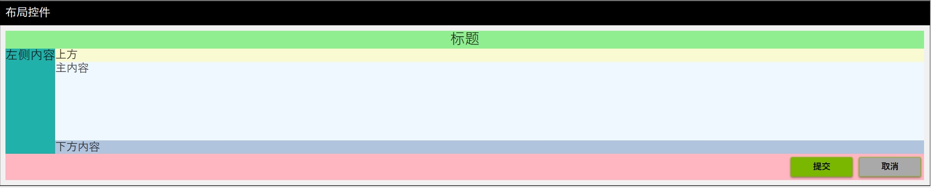
<Grid>
    <Grid.RowDefinitions>
        <RowDefinition Height="Auto" />
        <RowDefinition Height="*" />
        <RowDefinition Height="Auto" />
    </Grid.RowDefinitions>
    <Border Grid.Row="0" Background="LightGreen">
        <StackPanel
            HorizontalAlignment="Center"
            VerticalAlignment="Center"
            Orientation="Horizontal">
            <TextBlock
                Grid.Row="0"
                FontSize="24"
                Text="标题" />
        </StackPanel>
    </Border>
    <DockPanel Grid.Row="1">
        <TextBlock
            Background="LightSeaGreen"
            DockPanel.Dock="Left"
            FontSize="20"
            Text="左侧内容"
            TextAlignment="Center" />
        <TextBlock
            Background="LightGoldenrodYellow"
            DockPanel.Dock="Top"
            Text="上方" />
        <TextBlock
            Background="LightSteelBlue"
            DockPanel.Dock="Bottom"
            Text="下方内容" />
        <TextBlock Background="AliceBlue" Text="主内容" />
    </DockPanel>
    <Border Grid.Row="2" Background="LightPink">
        <WrapPanel
            Grid.Row="2"
            HorizontalAlignment="Right"
            Orientation="Horizontal">
            <Button
                Width="100"
                Margin="5"
                Content="提交"
                Style="{StaticResource MaterialDesignRaisedSecondaryDarkButton}" />
            <Button
                Width="100"
                Margin="5"
                Background="DarkGray"
                Content="取消"
                Style="{StaticResource MaterialDesignRaisedSecondaryDarkButton}" />
        </WrapPanel>
    </Border>
</Grid>
效果图:
- 内容控件(通常有一个子元素)
| 控件 | 说明 |
|---|---|
Button | 按钮 |
Label | 标签,不能选择文本 |
TextBlock | 显示文本(轻量) |
TextBox | 输入文本(可编辑) |
CheckBox / RadioButton | 选择项 |
Image | 显示图像 |
Border | 添加边框或圆角修饰 |
使用方法
<StackPanel
    Margin="10"
    HorizontalAlignment="Center"
    VerticalAlignment="Center">
    <!--  Button 按钮  -->
    <Button
        Width="100"
        Margin="5"
        Content="点击我" />

    <!--  Label 标签(不能选中文本)  -->
    <Label Margin="5" Content="我是标签" />

    <!--  TextBlock 文本显示(轻量)  -->
    <TextBlock
        Margin="5"
        Text="这是一个 TextBlock,用于显示文本"
        TextWrapping="Wrap" />

    <!--  TextBox 输入框  -->
    <TextBox
        Width="200"
        Margin="5"
        Text="请输入内容" />

    <!--  CheckBox & RadioButton  -->
    <CheckBox Margin="5" Content="我同意协议" />
    <StackPanel Margin="5" Orientation="Horizontal">
        <RadioButton
            Margin="0,0,10,0"
            Content="选项 A"
            GroupName="Options" />
        <RadioButton Content="选项 B" GroupName="Options" />
    </StackPanel>

    <!--  Image 显示图像  -->
    <!--  注意Source以根目录开始时需要使用pack://application:,,,  -->
    <Image
        Width="100"
        Height="100"
        Margin="5"
        Source="pack://application:,,,/Asset/logo.png" />

    <!--  Border 包裹元素并添加边框或圆角  -->
    <Border
        Margin="5"
        Padding="10"
        BorderBrush="Gray"
        BorderThickness="1"
        CornerRadius="5">
        <TextBlock Text="带圆角的边框内容" />
    </Border>
</StackPanel>- Items控件(可以绑定多个数据项)
| 控件 | 说明 |
|---|---|
ListBox | 列表 |
ComboBox | 下拉选择 |
ListView | 支持详细视图,列展示 |
TreeView | 树形结构 |
Menu, ContextMenu, ToolBar | 菜单相关 |
DataGrid | 类似表格,可编辑展示数据 |
使用方法
<!--  顶部菜单  -->
<Menu BorderBrush="Black" BorderThickness="1">
    <MenuItem Header="文件">
        <MenuItem Header="新建" />
        <MenuItem Header="打开" />
        <MenuItem Header="退出" />
    </MenuItem>
    <MenuItem Header="编辑">
        <MenuItem Header="复制" />
        <MenuItem Header="粘贴" />
    </MenuItem>
</Menu>

<!--  主体内容  -->
<ScrollViewer Grid.Row="1">
    <StackPanel
        Width="800"
        Margin="10"
        Orientation="Vertical">

        <!--  ListBox  -->
        <GroupBox Margin="0,5" Header="ListBox">
            <ListBox Width="200">
                <ListBoxItem>苹果</ListBoxItem>
                <ListBoxItem>香蕉</ListBoxItem>
                <ListBoxItem>橙子</ListBoxItem>
            </ListBox>
        </GroupBox>

        <!--  ComboBox  -->
        <GroupBox Margin="0,5" Header="ComboBox">
            <ComboBox Width="200">
                <ComboBoxItem>男</ComboBoxItem>
                <ComboBoxItem>女</ComboBoxItem>
                <ComboBoxItem>其他</ComboBoxItem>
            </ComboBox>
        </GroupBox>

        <!--  ListView  -->
        <GroupBox Margin="0,5" Header="ListView (需要绑定)">
            <ListView
                Width="400"
                Height="100"
                ItemsSource="{Binding People}">
                <ListView.View>
                    <GridView>
                        <GridViewColumn
                            Width="150"
                            DisplayMemberBinding="{Binding Name}"
                            Header="姓名" />
                        <GridViewColumn
                            Width="80"
                            DisplayMemberBinding="{Binding Age}"
                            Header="年龄" />
                    </GridView>
                </ListView.View>
            </ListView>
        </GroupBox>

        <!--  TreeView  -->
        <GroupBox Margin="0,5" Header="TreeView">
            <TreeView Width="200">
                <TreeViewItem Header="水果">
                    <TreeViewItem Header="苹果" />
                    <TreeViewItem Header="香蕉" />
                </TreeViewItem>
                <TreeViewItem Header="蔬菜">
                    <TreeViewItem Header="番茄" />
                    <TreeViewItem Header="黄瓜" />
                </TreeViewItem>
            </TreeView>
        </GroupBox>

        <!--  ToolBar  -->
        <GroupBox Margin="0,5" Header="ToolBar">
            <ToolBarTray>
                <ToolBar>
                    <Button Content="保存" />
                    <Button Content="打开" />
                    <Separator />
                    <Button Content="打印" />
                </ToolBar>
            </ToolBarTray>
        </GroupBox>

        <!--  DataGrid  -->
        <GroupBox Margin="0,5" Header="DataGrid (需要绑定)">
            <DataGrid
                Width="400"
                Height="150"
                AutoGenerateColumns="True"
                ItemsSource="{Binding People}" />
        </GroupBox>

        <!--  带右键菜单的按钮  -->
        <GroupBox Margin="0,5" Header="带右键菜单的按钮">
            <Button Content="右键点击我">
                <Button.ContextMenu>
                    <ContextMenu>
                        <MenuItem Header="剪切" />
                        <MenuItem Header="复制" />
                        <MenuItem Header="粘贴" />
                    </ContextMenu>
                </Button.ContextMenu>
            </Button>
        </GroupBox>

    </StackPanel>
</ScrollViewer>
资源(Resources)
Resources 中一般可以有:
<Application.Resources> -- 定义资源集合
    └── ResourceDictionary -- 存储资源的类(容器)。可以单独写在 .xaml 文件中,也可以内联使用。
        ├── [资源项1, 资源项2, ...]
        └── MergedDictionaries -- MergedDictionaries 是 ResourceDictionary 的一个属性,它允许你将多个外部的资源字典“合并”到当前资源中来
            ├── ResourceDictionary (Colors.xaml)
            ├── ResourceDictionary (Styles.xaml)
            └── ...
</Application.Resources>
资源可以定义以下内容:
- 样式(Style)
- 模板(Template)
- 触发器(Trigger) - 严格意义上不是资源的一种,但可以在资源中定义
- 自定义对象(比如自定义配置类)
资源作用域与查找规则:
- 控件本身显式指定的 Style;
- 父级控件的 Resources(例如 Grid、StackPanel);
- Window.Resources 或 UserControl.Resources;
- Application.Resources;
示例:
xml<UserControl.Resources> <ResourceDictionary> <!-- 优先于 App.xaml --> <SolidColorBrush x:Key="MyBrush" Color="Orange" /> </ResourceDictionary> </UserControl.Resources> <Grid> <StackPanel> <TextBlock Margin="5" Padding="10" Background="{StaticResource MyGlobalBrush}" Text="来自 App.Resources" /> <!-- 直接使用 UserControl 范围内的资源 --> <TextBlock Margin="5" Padding="10" Background="{StaticResource MyBrush}" Text="来自 UserControl.Resources" /> <Grid> <Grid.Resources> <!-- 优先于 Window 级 --> <SolidColorBrush x:Key="MyBrush" Color="LightGreen" /> </Grid.Resources> <StackPanel> <!-- 直接使用 Grid 范围内的资源 --> <TextBlock Margin="5" Padding="10" Background="{StaticResource MyBrush}" Text="来自 Grid.Resources" /> <!-- 在控件自身设置资源(最优先) --> <TextBlock Margin="5" Padding="10" Text="来自 TextBlock.Resources"> <TextBlock.Resources> <SolidColorBrush x:Key="MyBrush" Color="LightBlue" /> </TextBlock.Resources> <TextBlock.Background> <StaticResource ResourceKey="MyBrush" /> </TextBlock.Background> </TextBlock> <!-- 使用 DynamicResource 查看效果更明显 --> <TextBlock Margin="5" Padding="10" Background="{DynamicResource MyBrush}" Text="动态资源也遵循就近查找(来自 Grid.Resources)" /> </StackPanel> </Grid> </StackPanel> </GroupBox> </Grid>资源引用方式
- 静态资源(StaticResource)- 编译时确定资源(运行前解析)
示例:
xml<UserControl.Resources> <ResourceDictionary> <!-- 1. 颜色 --> <Color x:Key="PrimaryColor">#FF2196F3</Color> <!-- 2. 画刷 --> <SolidColorBrush x:Key="PrimaryBrush" Color="{StaticResource PrimaryColor}" /> <LinearGradientBrush x:Key="GradientBrush" StartPoint="0,0" EndPoint="1,1"> <GradientStop Offset="0" Color="White" /> <GradientStop Offset="1" Color="Blue" /> </LinearGradientBrush> <!-- 3. 字体 --> <FontFamily x:Key="HeaderFont">Segoe UI</FontFamily> <!-- 4. 边距 --> <Thickness x:Key="DefaultMargin">10</Thickness> <!-- 5. 样式 --> <Style x:Key="PrimaryButtonStyle" TargetType="Button"> <Setter Property="Background" Value="{StaticResource PrimaryBrush}" /> <Setter Property="Foreground" Value="White" /> <Setter Property="FontFamily" Value="{StaticResource HeaderFont}" /> <Setter Property="Margin" Value="{StaticResource DefaultMargin}" /> </Style> <!-- 6. 动画资源 --> <Storyboard x:Key="FadeInStoryboard"> <DoubleAnimation Storyboard.TargetProperty="Opacity" From="0" To="1" Duration="0:0:1" /> </Storyboard> <!-- 7. 自定义对象 --> <sys:String xmlns:sys="clr-namespace:System;assembly=mscorlib" x:Key="AppTitle">资源演示</sys:String> </ResourceDictionary> </UserControl.Resources> <Grid Margin="20"> <StackPanel> <TextBlock Width="140" Margin="0,0,0,10" FontSize="20" Text="{StaticResource AppTitle}" TextAlignment="Center" /> <Button Width="120" Height="40" Content="普通样式按钮" Style="{StaticResource PrimaryButtonStyle}" /> <Button Name="FadeInButton" Width="120" Height="40" Content="点击淡入"> <Button.Triggers> <EventTrigger RoutedEvent="Button.Click"> <BeginStoryboard Storyboard="{StaticResource FadeInStoryboard}" /> </EventTrigger> </Button.Triggers> </Button> </StackPanel> </Grid>- 动态资源(DynamicResource)- 在运行时查找并绑定资源值。
示例:
\Themes\CustomDark.xaml
xml<ResourceDictionary xmlns="http://schemas.microsoft.com/winfx/2006/xaml/presentation" xmlns:x="http://schemas.microsoft.com/winfx/2006/xaml"> <SolidColorBrush x:Key="CustomThemePrimaryBrush" Color="#FF673AB7" /> <SolidColorBrush x:Key="CustomThemeTextBrush" Color="White" /> </ResourceDictionary>\Themes\CustomLight.xaml
xml<ResourceDictionary xmlns="http://schemas.microsoft.com/winfx/2006/xaml/presentation" xmlns:x="http://schemas.microsoft.com/winfx/2006/xaml"> <SolidColorBrush x:Key="CustomThemePrimaryBrush" Color="White" /> <SolidColorBrush x:Key="CustomThemeTextBrush" Color="#FF673AB7" /> </ResourceDictionary>使用:
xml<UserControl.Resources> <ResourceDictionary> <!-- 一般在app.xaml中配置,此处仅作为示例 --> <ResourceDictionary.MergedDictionaries> <ResourceDictionary x:Name="CutomThemes" Source="pack://application:,,,/Themes/CustomLight.xaml" /> </ResourceDictionary.MergedDictionaries> </ResourceDictionary> </UserControl.Resources> <Grid Width="500" Margin="20"> <Grid.RowDefinitions> <RowDefinition /> <RowDefinition /> </Grid.RowDefinitions> <StackPanel Grid.Row="0" HorizontalAlignment="Right" VerticalAlignment="Center" Orientation="Horizontal"> <TextBlock VerticalAlignment="Center" Text="主题切换: " TextAlignment="Center" /> <ToggleButton x:Name="CustonThemeSwitch" Click="ToggleButton_Click" Style="{StaticResource MaterialDesignSwitchToggleButton}" /> </StackPanel> <Border Grid.Row="1"> <StackPanel VerticalAlignment="Center" Orientation="Vertical"> <TextBlock Margin="0,10" Padding="5" Background="{DynamicResource CustomThemePrimaryBrush}" FontSize="20" FontWeight="Bold" Foreground="{DynamicResource CustomThemeTextBrush}" Text="主题测试" TextAlignment="Center" /> <Button Margin="0,10" Background="{DynamicResource CustomThemePrimaryBrush}" Content="主题测试" FontSize="20" FontWeight="Bold" Foreground="{DynamicResource CustomThemeTextBrush}" /> </StackPanel> </Border> </Grid>c#private void ToggleButton_Click(object sender, RoutedEventArgs e) { SwitchTheme(CustonThemeSwitch.IsChecked ?? false ? "CustomDark" : "CustomLight"); }合并资源字典(MergedDictionaries)
- MergedDictionaries 用于将多个资源按 MergedDictionaries 中列出的顺序组合(合并)在一起。若有相同 Key,本地资源优先,后加载的合并字典也可覆盖前一个。
- MergedDictionaries 是为“资源模块化与组合”设计的。一般会将所有模块集中在Application.Resources中引用。
样式(Style)
样式的设置方式
- 控件内部直接设置样式相关的属性
- 在 资源(Resources)中设置
- 参考 资源(Resources)
样式查找顺序(优先级)
- 控件本身显式指定的 Style;
- Resources 中定义的样式(顺序参考 Resources 作用域与查找规则);
- 如果没有显式指定的 Style 则使用 隐式样式继承(基于控件类型)
- 以上均没有指定,则使用WPF的默认样式
常见样式总结
| 常设置属性 | 适用控件 | 示例值 |
|---|---|---|
Background | 所有控件(主要是容器、按钮等) | Blue, #FF123456 |
Foreground | 文本类控件 | White, Black |
FontSize | 文本类控件 | 14, 20 |
FontFamily | 文本类控件 | Segoe UI |
Padding | 内容控件 | 10, 10,5,10,5 |
Margin | 所有控件 | 5, 0,10,0,0 |
BorderBrush | 边框类控件 | Gray, Red |
BorderThickness | 边框类控件 | 1, 2,0,2,0 |
HorizontalAlignment | 所有控件 | Left, Center |
VerticalAlignment | 所有控件 | Top, Stretch |
- 示例:
 <UserControl.Resources>

     <!--  基础样式  -->
     <Style x:Key="BaseButtonStyle" TargetType="Button">
         <Setter Property="Foreground" Value="White" />
         <Setter Property="Background" Value="LightBlue" />
         <Setter Property="Padding" Value="10,5" />
         <Setter Property="Margin" Value="5" />
     </Style>

     <!--  派生样式  -->
     <Style
         x:Key="PrimaryButtonStyleFromBase"
         BasedOn="{StaticResource BaseButtonStyle}"
         TargetType="Button">
         <Setter Property="Background" Value="DarkBlue" />
     </Style>

     <!--  继承基础样式  -->
     <Style
         x:Key="DangerButtonStyleFromBase"
         BasedOn="{StaticResource BaseButtonStyle}"
         TargetType="Button">
         <Setter Property="Background" Value="DarkRed" />
         <!--  重写背景色  -->
     </Style>

     <!--  显示指定Style时失效  -->
     <Style TargetType="Button">
         <Setter Property="Foreground" Value="White" />
         <Setter Property="Background" Value="LightSeaGreen" />
         <Setter Property="Padding" Value="10,5" />
         <Setter Property="Margin" Value="5" />
     </Style>
 </UserControl.Resources>
 <Grid>
     <StackPanel VerticalAlignment="Top" Orientation="Vertical">
         <GroupBox
             Margin="0,10"
             materialDesign:ColorZoneAssist.Background="{DynamicResource MaterialDesign.Brush.Primary.Dark}"
             materialDesign:ColorZoneAssist.Foreground="{DynamicResource MaterialDesign.Brush.Primary.Dark.Foreground}"
             materialDesign:ColorZoneAssist.Mode="Custom"
             FontSize="18"
             Header=" 样式(Style)继承规则"
             Style="{StaticResource MaterialDesignGroupBox}">
             <Grid Width="350">
                 <StackPanel>
                     <Button
                         Margin="5"
                         Padding="10,5"
                         Background="DarkOliveGreen"
                         Content="内联定义"
                         Foreground="White" />
                     <Button Content="隐式样式继承(基于控件类型)" />
                     <Button Content="基础按钮" Style="{StaticResource BaseButtonStyle}" />
                     <Button Content="主按钮(继承自基础按钮)" Style="{StaticResource PrimaryButtonStyleFromBase}" />
                     <Button Content="危险按钮(继承自基础按钮)" Style="{StaticResource DangerButtonStyleFromBase}" />
                 </StackPanel>
             </Grid>
         </GroupBox>
     </StackPanel>
 </Grid>
模版(Template)
在 WPF(Windows Presentation Foundation)中,模板(Template) 是一种非常强大的机制,用于控制控件的外观,而不影响它的行为。模板允许你根据自己的需要完全自定义控件的 UI 结构,实现高可重用性和高可定制性。
- 模板的分类
| 模板类型 | 说明 |
|---|---|
| ControlTemplate | 控制控件的整体结构和外观,替换控件的默认可视树。适用于 Button、TextBox、ListBox 等控件。 |
| DataTemplate | 定义如何显示数据对象。通常用于列表控件(如 ListBox, ComboBox, ItemsControl)的 ItemTemplate。 |
示例 :
<UserControl.Resources>
    <ControlTemplate x:Key="CustomButtonTemplate" TargetType="Button">
        <Border
            Margin="10,0"
            Padding="10,0"
            Background="LightGreen"
            BorderBrush="Green"
            BorderThickness="1"
            CornerRadius="5">
            <ContentPresenter HorizontalAlignment="Center" VerticalAlignment="Center" />
        </Border>
    </ControlTemplate>

    <DataTemplate x:Key="PersonTemplate">
        <DockPanel Background="LightSeaGreen">
            <StackPanel
                Margin="5"
                HorizontalAlignment="Right"
                Orientation="Horizontal">

                <StackPanel Margin="10">
                    <TextBlock
                        FontSize="16"
                        FontWeight="Bold"
                        Text="{Binding Name}" />
                    <TextBlock FontSize="12" Text="{Binding Age, StringFormat='Age: {0}'}" />
                </StackPanel>
                <Border
                    Grid.Row="0"
                    BorderBrush="{DynamicResource MaterialDesignDivider}"
                    BorderThickness="0,0,0,1" />
                <Image
                    Width="50"
                    Height="50"
                    Margin="5"
                    Source="{Binding AvatarUrl}" />
            </StackPanel>

        </DockPanel>
    </DataTemplate>
</UserControl.Resources>
<Grid>
    <StackPanel VerticalAlignment="Top" Orientation="Vertical">
        <GroupBox
            Height="200"
            materialDesign:ColorZoneAssist.Background="{DynamicResource MaterialDesign.Brush.Primary.Dark}"
            materialDesign:ColorZoneAssist.Foreground="{DynamicResource MaterialDesign.Brush.Primary.Dark.Foreground}"
            materialDesign:ColorZoneAssist.Mode="Custom"
            FontSize="18"
            Header="ControlTemplate"
            Style="{StaticResource MaterialDesignGroupBox}">
            <WrapPanel VerticalAlignment="Center">
                <Button
                    Content="内联 ControlTemplate"
                    FontWeight="Bold"
                    Foreground="Black">
                    <Button.Template>
                        <!--  ControlTemplate 用于重定义按钮的外观,比如使用 Border 包裹内容。  -->
                        <ControlTemplate TargetType="Button">
                            <Border
                                Padding="10,0"
                                Background="LightBlue"
                                BorderBrush="Blue"
                                BorderThickness="1"
                                CornerRadius="5">
                                <!--  ContentPresenter 是模板中显示 Content 的占位符。  -->
                                <ContentPresenter HorizontalAlignment="Center" VerticalAlignment="Center" />
                            </Border>
                        </ControlTemplate>
                    </Button.Template>
                </Button>

                <Button
                    Content="引用Resources的ControlTemplate(可复用)"
                    FontWeight="Bold"
                    Foreground="Black"
                    Template="{StaticResource CustomButtonTemplate}" />

            </WrapPanel>

        </GroupBox>

        <GroupBox
            Height="300"
            Margin="0,10,0,0"
            materialDesign:ColorZoneAssist.Background="{DynamicResource MaterialDesign.Brush.Primary.Dark}"
            materialDesign:ColorZoneAssist.Foreground="{DynamicResource MaterialDesign.Brush.Primary.Dark.Foreground}"
            materialDesign:ColorZoneAssist.Mode="Custom"
            FontSize="18"
            Header="DataTemplate"
            Style="{StaticResource MaterialDesignGroupBox}">
            <Grid>
                <Grid.ColumnDefinitions>
                    <ColumnDefinition Width="*" />
                    <ColumnDefinition Width="5" />
                    <ColumnDefinition Width="*" />
                </Grid.ColumnDefinitions>

                <ListBox Grid.Column="0" ItemsSource="{Binding People}">
                    <!--  内联  -->
                    <ListBox.ItemTemplate>
                        <DataTemplate>
                            <Border
                                Grid.Row="0"
                                BorderBrush="{DynamicResource MaterialDesignDivider}"
                                BorderThickness="0,0,0,1">
                                <StackPanel Margin="5" Orientation="Horizontal">
                                    <Image
                                        Width="50"
                                        Height="50"
                                        Margin="5"
                                        Source="{Binding AvatarUrl}" />
                                    <StackPanel Margin="10">
                                        <TextBlock
                                            FontSize="16"
                                            FontWeight="Bold"
                                            Text="{Binding Name}" />
                                        <TextBlock FontSize="12" Text="{Binding Age, StringFormat='Age: {0}'}" />
                                    </StackPanel>


                                </StackPanel>
                            </Border>
                        </DataTemplate>
                    </ListBox.ItemTemplate>

                    <!--  设置样式使Item撑满每行  -->
                    <ListBox.ItemContainerStyle>
                        <Style TargetType="ListBoxItem">
                            <Setter Property="HorizontalContentAlignment" Value="Stretch" />
                        </Style>
                    </ListBox.ItemContainerStyle>
                </ListBox>

                <!--  垂直分割条  -->
                <GridSplitter
                    Grid.Column="1"
                    Width="1"
                    HorizontalAlignment="Stretch"
                    VerticalAlignment="Stretch"
                    Background="Gray"
                    ResizeBehavior="PreviousAndNext"
                    ShowsPreview="True" />

                <!--  关联Resource  -->
                <ListBox
                    Grid.Column="2"
                    ItemTemplate="{StaticResource PersonTemplate}"
                    ItemsSource="{Binding People}">

                    <ListBox.ItemContainerStyle>
                        <Style TargetType="ListBoxItem">
                            <Setter Property="HorizontalContentAlignment" Value="Stretch" />
                        </Style>
                    </ListBox.ItemContainerStyle>
                </ListBox>

            </Grid>
        </GroupBox>
    </StackPanel>
</Grid>
TemplateBinding 和 Binding
| 用法 | 适用场景简述 |
|---|---|
TemplateBinding | 在控件模板(ControlTemplate)内部绑定控件自身的属性,性能更好,语法更简洁。 |
Binding | 更通用,用于任何地方(包括模板中),功能更强(支持转换器、多级路径、RelativeSource等)。 |
触发器(Trigger)
触发器(Trigger) 是一种强大的机制,用于根据某些条件自动更改控件的属性(如颜色、字体、可见性等),而不需要编写后台代码。
- 常见触发器类型
| 类型 | 说明 | 使用位置 |
|---|---|---|
Trigger | 基于某个属性的值进行触发 | 样式(Style)中 |
DataTrigger | 基于绑定数据的值进行触发 | 样式或控件模板中 |
MultiTrigger | 基于多个属性值进行触发 | 样式中 |
MultiDataTrigger | 基于多个绑定数据值进行触发 | 样式或控件模板中 |
EventTrigger | 基于事件进行触发(如鼠标进入) | 控件模板中 |
- 属性触发器(Trigger)
示例:
    <StackPanel>
        <!--  TextBlock 没有 VerticalContentAlignment,设置Height后无法控制文本在自身高度内的垂直位置。可以通过Padding控制高度  -->
        <TextBlock
            Margin="0,10"
            Padding="10"
            Text="Hover Me"
            TextAlignment="Center"
            ToolTip="TextBlock 没有 VerticalContentAlignment,设置Height后无法控制文本在自身高度内的垂直位置。可以通过Padding控制高度">
            <TextBlock.Style>
                <Style TargetType="TextBlock">
                    <Setter Property="Background" Value="{DynamicResource MaterialDesign.Brush.Primary.Dark}" />
                    <Setter Property="Foreground" Value="{DynamicResource MaterialDesign.Brush.Primary.Dark.Foreground}" />
                    <Style.Triggers>
                        <Trigger Property="IsMouseOver" Value="True">
                            <Setter Property="Background" Value="{DynamicResource MaterialDesign.Brush.Secondary.Dark}" />
                            <Setter Property="Foreground" Value="{DynamicResource MaterialDesign.Brush.Secondary.Dark.Foreground}" />
                        </Trigger>
                    </Style.Triggers>
                </Style>
            </TextBlock.Style>
        </TextBlock>

        <!--  Button 有复杂的ControlTemplate,直接设置Background会失效  -->
        <Button
            Height="40"
            Margin="0,10"
            Content="Hover Me"
            ToolTip="Button 有复杂的ControlTemplate,直接设置Background会失效, 需要覆盖ControlTemplate">
            <Button.Style>
                <Style TargetType="Button">
                    <Setter Property="Template">
                        <Setter.Value>
                            <ControlTemplate TargetType="Button">
                                <Border
                                    Background="{TemplateBinding Background}"
                                    BorderBrush="{TemplateBinding BorderBrush}"
                                    BorderThickness="{TemplateBinding BorderThickness}">
                                    <ContentPresenter HorizontalAlignment="Center" VerticalAlignment="Center" />
                                </Border>
                            </ControlTemplate>
                        </Setter.Value>
                    </Setter>
                    <Setter Property="Background" Value="SlateGray" />
                    <Setter Property="Foreground" Value="White" />
                    <Style.Triggers>
                        <Trigger Property="IsMouseOver" Value="True">
                            <Setter Property="Background" Value="DarkOrange" />
                        </Trigger>
                    </Style.Triggers>
                </Style>
            </Button.Style>
        </Button>

    </StackPanel>
</Grid>- 多属性值触发(MultiTrigger )
<Border Width="350" Padding="15,10">
<StackPanel VerticalAlignment="Center" Orientation="Horizontal">
<TextBlock
Margin="10,0"
VerticalAlignment="Center"
Text="IsEnabled:" />
<ToggleButton IsChecked="{Binding ButtonEnabled}" Style="{StaticResource MaterialDesignSwitchToggleButton}" />
<Button
Height="40"
Margin="10,0"
Content="多个属性值触发"
IsEnabled="{Binding ButtonEnabled}"
ToolTip="IsEnabled and IsMouseOver => Opacity 0.8">
<Button.Style>
<Style BasedOn="{StaticResource MaterialDesignRaisedDarkButton}" TargetType="Button">
<Style.Triggers>
<MultiTrigger>
<MultiTrigger.Conditions>
<Condition Property="IsMouseOver" Value="True" />
<Condition Property="IsEnabled" Value="True" />
</MultiTrigger.Conditions>
<Setter Property="Opacity" Value="0.8" />
</MultiTrigger>
</Style.Triggers>
</Style>
</Button.Style>
</Button>
</StackPanel>
</Border>- 绑定值触发(DataTrigger )
<Border
    Width="350"
    Padding="15,10"
    CornerRadius="5">
    <Border.Resources>
        <Style TargetType="TextBlock">
            <Style.Triggers>
                <DataTrigger Binding="{Binding IsOnline}" Value="True">
                    <Setter Property="Foreground" Value="White" />
                </DataTrigger>
                <DataTrigger Binding="{Binding IsOnline}" Value="False">
                    <Setter Property="Foreground" Value="Black" />
                </DataTrigger>
            </Style.Triggers>
        </Style>
    </Border.Resources>
    <Border.Style>
        <Style TargetType="Border">
            <Style.Triggers>
                <DataTrigger Binding="{Binding IsOnline}" Value="True">
                    <Setter Property="Background" Value="{DynamicResource MaterialDesign.Brush.Secondary.Dark}" />
                </DataTrigger>
                <DataTrigger Binding="{Binding IsOnline}" Value="False">
                    <Setter Property="Background" Value="DarkGray" />
                </DataTrigger>
            </Style.Triggers>
        </Style>
    </Border.Style>
    <StackPanel VerticalAlignment="Center" Orientation="Horizontal">

        <ToggleButton IsChecked="{Binding IsOnline}" Style="{StaticResource MaterialDesignSwitchToggleButton}">
            <materialDesign:ToggleButtonAssist.SwitchTrackOnBackground>
                <SolidColorBrush Color="#085000" />
            </materialDesign:ToggleButtonAssist.SwitchTrackOnBackground>
            <materialDesign:ToggleButtonAssist.SwitchTrackOffBackground>
                <SolidColorBrush Color="White" />
            </materialDesign:ToggleButtonAssist.SwitchTrackOffBackground>
        </ToggleButton>
        <TextBlock
            Margin="10,0"
            VerticalAlignment="Center"
            Text="IsOnline:" />
        <TextBlock VerticalAlignment="Center" Text="{Binding IsOnline}" />
    </StackPanel>
</Border>- 多绑定值触发(MultiDataTrigger )
<Border
    Width="350"
    Padding="15,10"
    CornerRadius="5">
    <Border.Resources>
        <Style TargetType="TextBlock">
            <Setter Property="Foreground" Value="Black" />
            <Style.Triggers>
                <MultiDataTrigger>
                    <MultiDataTrigger.Conditions>
                        <Condition Binding="{Binding IsOnline}" Value="True" />
                        <Condition Binding="{Binding IsActive}" Value="True" />
                    </MultiDataTrigger.Conditions>
                    <Setter Property="Foreground" Value="White" />
                </MultiDataTrigger>
            </Style.Triggers>
        </Style>
    </Border.Resources>
    <Border.Style>
        <Style TargetType="Border">
            <Setter Property="Background" Value="DarkGray" />
            <Style.Triggers>
                <MultiDataTrigger>
                    <MultiDataTrigger.Conditions>
                        <Condition Binding="{Binding IsOnline}" Value="True" />
                        <Condition Binding="{Binding IsActive}" Value="True" />
                    </MultiDataTrigger.Conditions>
                    <Setter Property="Background" Value="{DynamicResource MaterialDesign.Brush.Secondary.Dark}" />
                </MultiDataTrigger>
            </Style.Triggers>
        </Style>
    </Border.Style>
    <Grid>
        <Grid.RowDefinitions>
            <RowDefinition />
            <RowDefinition Height="5" />
            <RowDefinition />
        </Grid.RowDefinitions>
        <StackPanel
            Grid.Row="0"
            VerticalAlignment="Center"
            Orientation="Horizontal">

            <ToggleButton IsChecked="{Binding IsOnline}" Style="{StaticResource MaterialDesignSwitchToggleButton}">
                <materialDesign:ToggleButtonAssist.SwitchTrackOnBackground>
                    <SolidColorBrush Color="#085000" />
                </materialDesign:ToggleButtonAssist.SwitchTrackOnBackground>
                <materialDesign:ToggleButtonAssist.SwitchTrackOffBackground>
                    <SolidColorBrush Color="White" />
                </materialDesign:ToggleButtonAssist.SwitchTrackOffBackground>
            </ToggleButton>
            <TextBlock
                Margin="10,0"
                VerticalAlignment="Center"
                Text="IsOnline:" />
            <TextBlock VerticalAlignment="Center" Text="{Binding IsOnline}" />
        </StackPanel>
        <StackPanel
            Grid.Row="2"
            VerticalAlignment="Center"
            Orientation="Horizontal">
            <ToggleButton IsChecked="{Binding IsActive}" Style="{StaticResource MaterialDesignSwitchToggleButton}">
                <materialDesign:ToggleButtonAssist.SwitchTrackOnBackground>
                    <SolidColorBrush Color="#085000" />
                </materialDesign:ToggleButtonAssist.SwitchTrackOnBackground>
                <materialDesign:ToggleButtonAssist.SwitchTrackOffBackground>
                    <SolidColorBrush Color="White" />
                </materialDesign:ToggleButtonAssist.SwitchTrackOffBackground>
            </ToggleButton>
            <TextBlock
                Margin="10,0"
                VerticalAlignment="Center"
                Text="IsActive:" />
            <TextBlock VerticalAlignment="Center" Text="{Binding IsActive}" />
        </StackPanel>
    </Grid>
</Border>- 触发动画(EventTrigger )
<Border Width="350">
    <Button Height="40" Content="Animate Me">
        <Button.Triggers>
            <EventTrigger RoutedEvent="Button.Click">
                <BeginStoryboard>
                    <Storyboard>
                        <DoubleAnimation
                            Storyboard.TargetProperty="Opacity"
                            From="0.4"
                            To="1"
                            Duration="0:0:1" />
                    </Storyboard>
                </BeginStoryboard>
            </EventTrigger>
        </Button.Triggers>
    </Button>
</Border>- 常见的 EventTrigger 事件类型(按控件通用性分类)
| 事件名称 | 说明 | 典型适用控件 |
|---|---|---|
Loaded | 控件加载完毕时触发 | 所有控件 |
MouseEnter | 鼠标进入控件区域时触发 | Button、Panel、Border 等 |
MouseLeave | 鼠标离开控件区域时触发 | 同上 |
MouseLeftButtonDown | 鼠标左键按下时触发 | 所有 UIElement |
MouseLeftButtonUp | 鼠标左键释放时触发 | 同上 |
MouseRightButtonDown | 鼠标右键按下时触发 | 同上 |
Click | 按钮点击(仅 ButtonBase) | Button、ToggleButton |
GotFocus | 控件获取焦点时触发 | TextBox、Button、ComboBox |
LostFocus | 控件失去焦点时触发 | 同上 |
IsVisibleChanged | 可见性变化时触发 | 所有可视控件 |
SizeChanged | 尺寸变化时触发 | Grid、Window、Image 等 |
SelectionChanged | 选择项变化(如 ComboBox、ListBox) | ComboBox、ListBox、DataGrid |
TextChanged | 文本变化 | TextBox |
ScrollChanged | 滚动条变化 | ScrollViewer |
XAML.cs(交互)
.xaml.cs 文件是与 .xaml 文件配套的「后台代码文件」(code-behind),用来处理逻辑代码。.xaml 主要负责界面布局和样式,而 .xaml.cs 负责事件处理、逻辑控制、初始化等功能。
事件处理
事件处理是用户与 UI 控件交互的重要机制。WPF 支持丰富的事件系统,通过事件处理器,可以响应按钮点击、鼠标移动、键盘输入、窗口加载等各种操作。
WPF 的事件系统是基于强大的 路由事件(Routed Events)机制,它不仅支持传统的控件事件响应,还支持跨控件层级的事件传播。
路由事件(Routed Events) :事件在 WPF 的控件树中沿一定的路径传递(传播),而不是仅在事件源控件上触发。
- 路由方式
| 路由方式 | 说明 | 举例 |
|---|---|---|
| 冒泡(Bubble) | 从事件源向外冒泡至父级控件 | Button.Click |
| 隧道(Tunnel) | 从根向子级控件传递(预览事件,Preview 开头) | PreviewMouseDown |
| 直接(Direct) | 仅在事件源控件上触发,不进行路由传递 | Loaded、TextChanged |
- 示例
- 冒泡(Bubble)事件
提示
可以使用 e.Handled = true; 阻断事件继续向父控件传播。
<Grid Height="300">
    <Grid.ColumnDefinitions>
        <ColumnDefinition />
        <ColumnDefinition />
    </Grid.ColumnDefinitions>
    <Border
        Grid.Column="0"
        Margin="5,0"
        Padding="10"
        Background="LightGray">

        <StackPanel
            Margin="10,0"
            HorizontalAlignment="Stretch"
            Background="{StaticResource MaterialDesign.Brush.Primary.Light}"
            Button.Click="StackPanel_GrandParent_ButtonClick">
            <TextBlock
                Margin="20,10"
                Foreground="White"
                Text="祖父控件" />

            <CheckBox
                x:Name="GrandParentCheckBox"
                Margin="20,10"
                Content="是否阻断祖父控件冒泡"
                Foreground="White"
                IsChecked="False"
                Style="{StaticResource MaterialDesignSecondaryCheckBox}" />

            <StackPanel
                Margin="10,0"
                HorizontalAlignment="Stretch"
                Background="{StaticResource MaterialDesign.Brush.Primary}"
                Button.Click="StackPanel_Parent_ButtonClick">

                <TextBlock
                    Margin="20,10"
                    Foreground="White"
                    Text="父控件" />

                <CheckBox
                    x:Name="ParentCheckBox"
                    Margin="20,10"
                    Content="是否阻断父控件冒泡"
                    Foreground="White"
                    IsChecked="False"
                    Style="{StaticResource MaterialDesignSecondaryCheckBox}" />

                <Button
                    Width="200"
                    Height="40"
                    Margin="10,10"
                    HorizontalAlignment="Center"
                    Click="Button_Click"
                    Content="冒泡测试"
                    Style="{StaticResource MaterialDesignRaisedDarkButton}" />

                <CheckBox
                    x:Name="ButtonCheckBox"
                    Margin="0,10"
                    HorizontalAlignment="Center"
                    Content="是否阻断按钮冒泡"
                    Foreground="White"
                    IsChecked="False"
                    Style="{StaticResource MaterialDesignSecondaryCheckBox}" />
            </StackPanel>
        </StackPanel>
    </Border>

    <Border
        Grid.Column="1"
        Margin="5,0"
        BorderBrush="{DynamicResource MaterialDesign.Brush.Primary.Dark}"
        BorderThickness="1">
        <Grid>
            <Grid.RowDefinitions>
                <RowDefinition />
                <RowDefinition Height="40" />
            </Grid.RowDefinitions>
            <StackPanel Grid.Row="1" Margin="3">
                <Button
                    Width="200"
                    Click="ClearButton_Click"
                    Content="清空日志"
                    Style="{StaticResource MaterialDesignFlatDarkButton}" />
            </StackPanel>
            <ScrollViewer Grid.Row="0" Background="LightGray">
                <ListView x:Name="clickEventRecord" />
            </ScrollViewer>
        </Grid>

    </Border>
</Grid>// Button 自身的 Click 事件
private void Button_Click(object sender, RoutedEventArgs e)
{
clickEventRecord.Items.Add(
new ListViewItem
{
Content = "按钮触发了 Click 事件",
Background = FindResource("MaterialDesign.Brush.Primary.Dark") as Brush,
Foreground = Brushes.White,
}
);
if (ButtonCheckBox.IsChecked ?? false)
{
e.Handled = true;
}
}
private void StackPanel_Parent_ButtonClick(object sender, RoutedEventArgs e)
{
clickEventRecord.Items.Add(
new ListViewItem
{
Content = "父控件触发了 Click 事件",
Background = FindResource("MaterialDesign.Brush.Primary") as Brush,
Foreground = Brushes.White,
}
);
if (ParentCheckBox.IsChecked ?? false)
{
e.Handled = true;
}
}
private void StackPanel_GrandParent_ButtonClick(object sender, RoutedEventArgs e)
{
clickEventRecord.Items.Add(
new ListViewItem
{
Content = "祖父控件触发了 Click 事件",
Background = FindResource("MaterialDesign.Brush.Primary.Light") as Brush,
Foreground = Brushes.White,
}
);
if (GrandParentCheckBox.IsChecked ?? false)
{
e.Handled = true;
}
}
private void ClearButton_Click(object sender, RoutedEventArgs e)
{
clickEventRecord.Items.Clear();
}- 隧道(Tunnel)事件
提示
- 也可以使用
e.Handled = true;阻断事件继续向父控件传播。 - 使用隧道事件要充分考虑子元素行为。如:
PreviewMouseDown事件会被父组件优先处理,如果阻断传播会导致子元素无法触发事件而丧失默认行为。
<Grid Height="400">
    <Grid.ColumnDefinitions>
        <ColumnDefinition />
        <ColumnDefinition />
    </Grid.ColumnDefinitions>
    <Grid Grid.Column="0">
        <Grid.RowDefinitions>
            <RowDefinition />
            <RowDefinition Height="160" />
        </Grid.RowDefinitions>

        <Border
            Grid.Row="0"
            Margin="5,0"
            Padding="10"
            Background="LightGray">

            <StackPanel
                Margin="10,0"
                HorizontalAlignment="Stretch"
                Background="{StaticResource MaterialDesign.Brush.Primary.Light}"
                Button.PreviewMouseDown="StackPanel_Tunneling_GrandParent_ButtonClick">
                <TextBlock
                    Margin="20,10"
                    Foreground="White"
                    Text="祖父控件" />

                <StackPanel
                    Margin="10,0"
                    HorizontalAlignment="Stretch"
                    Background="{StaticResource MaterialDesign.Brush.Primary}"
                    Button.PreviewMouseDown="StackPanel_Tunneling_Parent_ButtonClick">

                    <TextBlock
                        Margin="20,10"
                        Foreground="White"
                        Text="父控件" />

                    <Button
                        Width="200"
                        Height="40"
                        Margin="10,10"
                        HorizontalAlignment="Center"
                        Content="隧道测试"
                        PreviewMouseDown="Button_Tunneling_Click"
                        Style="{StaticResource MaterialDesignRaisedDarkButton}" />


                </StackPanel>
            </StackPanel>
        </Border>

        <StackPanel Grid.Row="1">
            <materialDesign:Chip
                Content="CheckBox放在StackPanal内时,由于 PreviewMouseDown 事件会被父组件优先处理"
                Icon="Tip"
                Style="{StaticResource MaterialDesignOutlineChip}" />
            <materialDesign:Chip
                Content="CheckBox的点击会先经过父组件。如果IsChecked则不会传递到子组件从而无法取消选择"
                Icon="Tip"
                Style="{StaticResource MaterialDesignOutlineChip}" />

            <CheckBox
                x:Name="GrandParentTunnelingCheckBox"
                Margin="0"
                Content="是否阻断祖父控件冒泡"
                IsChecked="False"
                Style="{StaticResource MaterialDesignCheckBox}" />
            <CheckBox
                x:Name="ParentTunnelingCheckBox"
                Margin="0"
                Content="是否阻断父控件冒泡"
                IsChecked="False"
                Style="{StaticResource MaterialDesignCheckBox}" />
            <CheckBox
                x:Name="ButtonTunnelingCheckBox"
                Margin="0"
                Content="是否阻断按钮冒泡"
                IsChecked="False"
                Style="{StaticResource MaterialDesignCheckBox}" />
        </StackPanel>
    </Grid>
    <Border
        Grid.Column="1"
        Margin="5,0"
        BorderBrush="{DynamicResource MaterialDesign.Brush.Primary.Dark}"
        BorderThickness="1">
        <Grid>
            <Grid.RowDefinitions>
                <RowDefinition />
                <RowDefinition Height="40" />
            </Grid.RowDefinitions>
            <StackPanel Grid.Row="1" Margin="3">
                <Button
                    Width="200"
                    Click="ClearButton_Tunneling_Click"
                    Content="清空日志"
                    Style="{StaticResource MaterialDesignFlatDarkButton}" />
            </StackPanel>
            <ScrollViewer Grid.Row="0" Background="LightGray">
                <ListView x:Name="clickTunnelingEventRecord" />
            </ScrollViewer>
        </Grid>

    </Border>
</Grid>private void Button_Tunneling_Click(object sender, RoutedEventArgs e)
{
clickTunnelingEventRecord.Items.Add(
new ListViewItem
{
Content = "按钮触发了 PreviewMouseDown 事件",
Background = FindResource("MaterialDesign.Brush.Primary.Dark") as Brush,
Foreground = Brushes.White,
}
);
if (ButtonTunnelingCheckBox.IsChecked ?? false)
{
e.Handled = true;
}
}
private void StackPanel_Tunneling_Parent_ButtonClick(object sender, RoutedEventArgs e)
{
clickTunnelingEventRecord.Items.Add(
new ListViewItem
{
Content = "父控件触发了 PreviewMouseDown 事件",
Background = FindResource("MaterialDesign.Brush.Primary") as Brush,
Foreground = Brushes.White,
}
);
if (ParentTunnelingCheckBox.IsChecked ?? false)
{
e.Handled = true;
}
}
private void StackPanel_Tunneling_GrandParent_ButtonClick(object sender, RoutedEventArgs e)
{
clickTunnelingEventRecord.Items.Add(
new ListViewItem
{
Content = "祖父控件触发了 PreviewMouseDown 事件",
Background = FindResource("MaterialDesign.Brush.Primary.Light") as Brush,
Foreground = Brushes.White,
}
);
if (GrandParentTunnelingCheckBox.IsChecked ?? false)
{
e.Handled = true;
}
}
private void ClearButton_Tunneling_Click(object sender, RoutedEventArgs e)
{
clickTunnelingEventRecord.Items.Clear();
}- 直接(Direct)事件
<StackPanel
    Width="400"
    Height="240"
    Margin="20">
    <materialDesign:Chip
        Content="直接事件(Direct Events)只监听控件本身"
        Icon="Tip"
        Style="{StaticResource MaterialDesignOutlineChip}" />
    <TextBox
        Name="MyTextBox"
        Width="400"
        Margin="0,15"
        materialDesign:TextFieldAssist.HasClearButton="True"
        Style="{StaticResource MaterialDesignOutlinedTextBox}"
        TextChanged="MyTextBox_TextChanged" />
    <TextBlock
        Name="OutputTextBlock"
        Margin="0,15"
        TextWrapping="Wrap" />
</StackPanel> private void MyTextBox_TextChanged(object sender, TextChangedEventArgs e)
{
OutputTextBlock.Text = "输入:" + MyTextBox.Text;
}
private void StackPanel_Custom_Parent_ButtonClick(object sender, RoutedEventArgs e)
{
customClickEventRecord.Items.Add(
new ListViewItem
{
Content = "父控件触发了 CustomClick 事件",
Background = FindResource("MaterialDesign.Brush.Primary") as Brush,
Foreground = Brushes.White,
}
);
}WPF 常见事件列表(按控件/功能分类)
通用控件事件(大多数控件通用)
| 事件名 | 路由类型 | 说明 |
|---|---|---|
Loaded | Direct | 控件加载完毕时触发 |
Unloaded | Direct | 控件卸载时触发 |
Initialized | Direct | 控件初始化时触发 |
DataContextChanged | Direct | 数据上下文改变时 |
IsVisibleChanged | Direct | 可见性变化 |
- 按钮相关事件(Button、ToggleButton)
| 事件名 | 路由类型 | 说明 |
|---|---|---|
Click | Bubble | 按钮被点击 |
Checked | Bubble | Toggle按钮被选中 |
Unchecked | Bubble | Toggle按钮取消选中 |
- 鼠标事件
| 事件名 | 路由类型 | 说明 |
|---|---|---|
MouseEnter | Direct | 鼠标进入控件范围 |
MouseLeave | Direct | 鼠标离开控件范围 |
MouseMove | Bubble | 鼠标在控件上移动 |
MouseDown | Bubble | 鼠标按下 |
MouseUp | Bubble | 鼠标抬起 |
PreviewMouseDown | Tunnel | 鼠标按下前的隧道事件 |
- 键盘事件
| 事件名 | 路由类型 | 说明 |
|---|---|---|
KeyDown | Bubble | 键被按下 |
KeyUp | Bubble | 键被抬起 |
PreviewKeyDown | Tunnel | 键盘按下前隧道事件 |
TextInput | Bubble | 输入字符(可组合键) |
- 文本框(TextBox)常见事件
| 事件名 | 路由类型 | 说明 |
|---|---|---|
TextChanged | Direct | 文本内容变化时 |
GotFocus | Bubble | 获得焦点 |
LostFocus | Bubble | 失去焦点 |
- 列表和选择类控件(ComboBox、ListBox)
| 事件名 | 路由类型 | 说明 |
|---|---|---|
SelectionChanged | Bubble | 当前选择项发生变化 |
- 拖拽和剪贴板
| 事件名 | 路由类型 | 说明 |
|---|---|---|
DragEnter | Bubble | 拖入时触发 |
Drop | Bubble | 拖放完成 |
ClipboardCopy | Direct | 拷贝事件(可自定义) |
- 自定义事件
提示
自定义事件需要借助自定义控件注册,
WPF与Vue存在明显不同,其基本控制单位为控件。
按钮定义 CustomButton.cs
using System;
using System.Collections.Generic;
using System.Linq;
using System.Text;
using System.Threading.Tasks;
using System.Windows;
using System.Windows.Controls;
using System.Windows.Data;
using System.Windows.Documents;
using System.Windows.Input;
using System.Windows.Media;
using System.Windows.Media.Imaging;
using System.Windows.Navigation;
using System.Windows.Shapes;

namespace WpfCustomControlLibrary
{
    /// <summary>
    /// 按照步骤 1a 或 1b 操作,然后执行步骤 2 以在 XAML 文件中使用此自定义控件。
    ///
    /// 步骤 1a) 在当前项目中存在的 XAML 文件中使用该自定义控件。
    /// 将此 XmlNamespace 特性添加到要使用该特性的标记文件的根
    /// 元素中:
    ///
    ///     xmlns:MyNamespace="clr-namespace:WpfCustomControlLibrary"
    ///
    ///
    /// 步骤 1b) 在其他项目中存在的 XAML 文件中使用该自定义控件。
    /// 将此 XmlNamespace 特性添加到要使用该特性的标记文件的根
    /// 元素中:
    ///
    ///     xmlns:MyNamespace="clr-namespace:WpfCustomControlLibrary;assembly=WpfCustomControlLibrary"
    ///
    /// 您还需要添加一个从 XAML 文件所在的项目到此项目的项目引用,
    /// 并重新生成以避免编译错误:
    ///
    ///     在解决方案资源管理器中右击目标项目,然后依次单击
    ///     “添加引用”->“项目”->[浏览查找并选择此项目]
    ///
    ///
    /// 步骤 2)
    /// 继续操作并在 XAML 文件中使用控件。
    ///
    ///     <MyNamespace:CustomButton/>
    ///
    /// </summary>
    public class CustomButton : Button
    {
        public static readonly RoutedEvent MyClickEvent = EventManager.RegisterRoutedEvent(
            "MyClick", // 事件名称
            RoutingStrategy.Bubble, // 路由策略(可以是 Bubble、Tunnel 或 Direct)
            typeof(RoutedEventHandler), // 事件处理器类型
            typeof(CustomButton)
        ); // 所属类型

        static CustomButton()
        {
            DefaultStyleKeyProperty.OverrideMetadata(
                typeof(CustomButton),
                new FrameworkPropertyMetadata(typeof(CustomButton))
            );
        }

        // CLR事件包装器
        public event RoutedEventHandler MyClick
        {
            add { AddHandler(MyClickEvent, value); }
            remove { RemoveHandler(MyClickEvent, value); }
        }

        // 方法:触发事件
        protected void RaiseMyClickEvent()
        {
            RoutedEventArgs args = new(MyClickEvent);
            RaiseEvent(args);
        }

        // 示例:右键点击控件时触发事件
        protected override void OnMouseRightButtonDown(MouseButtonEventArgs e)
        {
            base.OnMouseLeftButtonDown(e);
            RaiseMyClickEvent();
        }
    }
}
页面调用:
<Grid Height="300">
    <Grid.ColumnDefinitions>
        <ColumnDefinition />
        <ColumnDefinition />
    </Grid.ColumnDefinitions>
    <Border
        Grid.Column="0"
        Margin="5,0"
        Padding="10"
        Background="LightGray">
        <StackPanel
            Margin="10,0"
            HorizontalAlignment="Stretch"
            customcontrollibrary:CustomButton.MyClick="StackPanel_Custom_Parent_ButtonClick"
            Background="{StaticResource MaterialDesign.Brush.Primary}">

            <TextBlock
                Margin="20,10"
                Foreground="White"
                Text="父控件" />

            <customcontrollibrary:CustomButton
                Width="300"
                Content="自定义按钮(右击触发,冒泡)"
                MyClick="MyCustomControl_MyClick"
                Style="{StaticResource MaterialDesignRaisedDarkButton}" />

        </StackPanel>
    </Border>

    <Border
        Grid.Column="1"
        Margin="5,0"
        BorderBrush="{DynamicResource MaterialDesign.Brush.Primary.Dark}"
        BorderThickness="1">
        <Grid>
            <Grid.RowDefinitions>
                <RowDefinition />
                <RowDefinition Height="40" />
            </Grid.RowDefinitions>
            <StackPanel Grid.Row="1" Margin="3">

                <Button
                    Width="200"
                    Click="ClearButton_CustomClick"
                    Content="清空日志"
                    Style="{StaticResource MaterialDesignFlatDarkButton}" />
            </StackPanel>
            <ScrollViewer Grid.Row="0" Background="LightGray">
                <ListView x:Name="customClickEventRecord" />
            </ScrollViewer>
        </Grid>

    </Border>
</Grid>private void MyCustomControl_MyClick(object sender, RoutedEventArgs e)
{
customClickEventRecord.Items.Add(
new ListViewItem
{
Content = "自定义按钮触发 CustomClick 事件",
Background = FindResource("MaterialDesign.Brush.Primary.Dark") as Brush,
Foreground = Brushes.White,
}
);
}
private void ClearButton_CustomClick(object sender, RoutedEventArgs e)
{
customClickEventRecord.Items.Clear();
}控件访问和动态操作
- 访问方式
| 访问方式 | 使用场景 |
|---|---|
x:Name | 大部分静态控件,主窗口 |
FindName | 运行时查找,非模板控件 |
LogicalTreeHelper | 在逻辑结构中查找,适合容器控件 |
VisualTreeHelper | 查找模板控件、复杂嵌套控件 |
sender as 控件类型 | 事件中判断哪个控件触发了事件 |
示例:
<StackPanel VerticalAlignment="Top" Orientation="Vertical">
    <TextBlock
        x:Name="MyTextBlock"
        Padding="10"
        Background="{DynamicResource MaterialDesign.Brush.Primary.Light}"
        FontSize="20"
        Foreground="White"
        Text="TextBlock"
        TextAlignment="Left" />
    <WrapPanel Margin="0,10">
        <WrapPanel.Resources>
            <Style BasedOn="{StaticResource MaterialDesignRaisedDarkButton}" TargetType="Button">
                <Setter Property="FontSize" Value="16" />
                <Setter Property="FontWeight" Value="Bold" />
                <Setter Property="Margin" Value="5" />
            </Style>
        </WrapPanel.Resources>
        <Button Click="FindControlWithName" Content="通过实例(Name)访问" />
        <Button Click="FindControlWithFindName" Content="通过FindName方法访问" />
        <Button Click="FindControlWithLogicalTreeHelper" Content="通过逻辑树(LogicalTreeHelper)查找" />
        <Button Click="FindControlWithVisualTreeHelper" Content="通过视觉树(VisualTreeHelper)查找" />
        <Button Click="FindControlWithSender" Content="通过事件参数(sender)获取控件" />
    </WrapPanel>
</StackPanel>
xaml.cs
/// <summary>
/// 通过实例(Name)访问
///
/// 类型安全(自动识别控件类型)
/// 编译时检查
/// 推荐用于大部分静态控件
/// </summary>
private void FindControlWithName(object sender, RoutedEventArgs e)
{
    MyTextBlock.Text = "Updated With Name!";
    MyTextBlock.Background = Brushes.DarkRed;
}

/// <summary>
/// 通过FindName方法访问(动态查找)
///
/// FindName 只会查找该 XAML 的当前 NameScope(通常是 Window 或 UserControl)
/// </summary>
private void FindControlWithFindName(object sender, RoutedEventArgs e)
{
    var textBlock = (TextBlock)FindName("MyTextBlock");
    if (textBlock != null)
    {
        textBlock.Text = "Updated With FindName!";
        textBlock.Background = Brushes.DarkOrange;
    }
}

/// <summary>
/// 通过逻辑树(LogicalTreeHelper)查找
///
/// 用于在容器控件(如 StackPanel、Grid)中递归查找控件。
/// </summary>
private void FindControlWithLogicalTreeHelper(object sender, RoutedEventArgs e)
{
    if (sender is not Button clickedButton)
    {
        return;
    }

    if (clickedButton?.Parent is not FrameworkElement parent)
    {
        return;
    }

    if (parent.Parent is not FrameworkElement grandParent)
    {
        return;
    }

    var textBlock = FindLogicalChild<TextBlock>(grandParent, "MyTextBlock");
    if (textBlock != null)
    {
        MyTextBlock.Text = "Updated With LogicalTreeHelper!";
        MyTextBlock.Background = Brushes.DarkGreen;
    }
}

public static T? FindLogicalChild<T>(DependencyObject parent, string childName)
    where T : FrameworkElement
{
    foreach (var child in LogicalTreeHelper.GetChildren(parent))
    {
        if (child is DependencyObject depChild)
        {
            if (depChild is T frameworkElement && frameworkElement.Name == childName)
                return frameworkElement;

            var result = FindLogicalChild<T>(depChild, childName);
            if (result != null)
                return result;
        }
    }
    return null;
}

/// <summary>
/// 通过视觉树(VisualTreeHelper)查找
///
/// 用于查找嵌套较深的控件,如 Template、DataTemplate 中的控件。
/// </summary>
private void FindControlWithVisualTreeHelper(object sender, RoutedEventArgs e)
{
    if (sender is not Button clickedButton)
    {
        return;
    }

    if (clickedButton?.Parent is not FrameworkElement parent)
    {
        return;
    }

    if (parent.Parent is not FrameworkElement grandParent)
    {
        return;
    }

    var textBlock = FindVisualChild<TextBlock>(grandParent);
    if (textBlock != null)
    {
        MyTextBlock.Text = "Updated With VisualTreeHelper!";
        MyTextBlock.Background = Brushes.DarkSlateBlue;
    }
}

/// <summary>
/// 返回该类型的第一个
/// </summary>
/// <typeparam name="T"></typeparam>
/// <param name="parent"></param>
/// <returns></returns>
public static T? FindVisualChild<T>(DependencyObject parent)
    where T : DependencyObject
{
    for (int i = 0; i < VisualTreeHelper.GetChildrenCount(parent); i++)
    {
        var child = VisualTreeHelper.GetChild(parent, i);
        if (child is T typedChild)
            return typedChild;

        var result = FindVisualChild<T>(child);
        if (result != null)
            return result;
    }
    return null;
}

private readonly ReaderWriterLockSlim rwLock = new();

/// <summary>
/// 通过事件参数(sender)获取控件
/// </summary>
private void FindControlWithSender(object sender, RoutedEventArgs e)
{
    if (sender is not Button clickedButton)
    {
        return;
    }
    try
    {
        rwLock.EnterWriteLock(); // 进入写锁
        var temp = (clickedButton.Content, clickedButton.Background);

        clickedButton.Content = "Updated With Sender!";
        clickedButton.Background = Brushes.DarkSeaGreen;
        Task.Run(async () =>
        {
            for (int i = 8; i >= 0; i--)
            {
                await Task.Delay(1000);
                Dispatcher.Invoke(() =>
                {
                    clickedButton.Content = $"Updated With Sender! {i} 秒后恢复";
                });
            }
            Dispatcher.Invoke(() =>
            {
                clickedButton.Content = temp.Content;
                clickedButton.Background = temp.Background;
                rwLock.ExitWriteLock(); // 释放写锁
            });
        });
    }
    catch (LockRecursionException) { }
    catch (Exception)
    {
        if (rwLock.IsWriteLockHeld)
            rwLock.ExitWriteLock();
    }
}- 动态创建控件
示例:
<StackPanel
    x:Name="MainStackPanel"
    Width="280"
    Margin="10">
    <Button
        Height="30"
        Margin="0,0,0,10"
        Click="AddControls_Click"
        Content="添加控件" />
</StackPanel> private int counter = 1;
private void AddControls_Click(object sender, RoutedEventArgs e)
{
// 创建 Label
Label label = new()
{
Name = $"DynamicLabel_{counter}",
Margin = new Thickness(0, 10, 0, 10),
Content = $"动态标签 {counter}",
FontSize = 18,
Foreground = Brushes.Black,
FontWeight = FontWeights.Black,
};
// 创建 TextBox
TextBox textBox = new()
{
Margin = new Thickness(0, 5, 0, 5),
Name = $"TextBox_{counter}",
Style = FindResource("MaterialDesignOutlinedTextBox") as System.Windows.Style,
};
// 创建 Button
Button button = new()
{
Content = "提交",
Tag = textBox, // 将 TextBox 绑定到 Button 的 Tag 方便访问
};
button.Click += DynamicButton_Click;
// 添加到 StackPanel
MainStackPanel.Children.Add(label);
MainStackPanel.Children.Add(textBox);
MainStackPanel.Children.Add(button);
counter++;
}
private async void DynamicButton_Click(object sender, RoutedEventArgs e)
{
if (sender is Button btn && btn.Tag is TextBox txt)
{
var tipName = string.Empty;
if (btn.Parent != null)
{
tipName = FindLogicalChildMatchWithName<Label>(btn.Parent, "DynamicLabel_")
?.Content.ToString();
}
await GlobalNotifier.ShowInfoDialog(txt.Text, $"已输入({tipName})");
}
}- 跨线程访问UI
危险
UI 控件只能在创建它们的主线程中访问。如果你在后台线程(比如使用 Task、Thread、Timer 等)中尝试直接更新 UI,就会抛出异常:
InvalidOperationException: The calling thread cannot access this object because a different thread owns it.解决方式:
| 方法 | 说明 |
|---|---|
Dispatcher.Invoke(...) | 同步调用 UI 线程,阻塞当前线程直到执行完成 |
Dispatcher.BeginInvoke(...) | 异步调用,不阻塞当前线程 |
生命周期事件
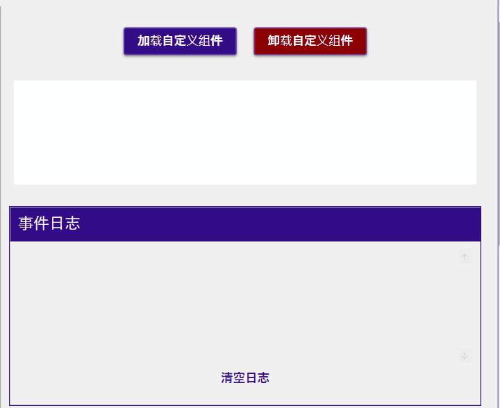
控件(Control/UserControl)生命周期
以加载自定义控件为例

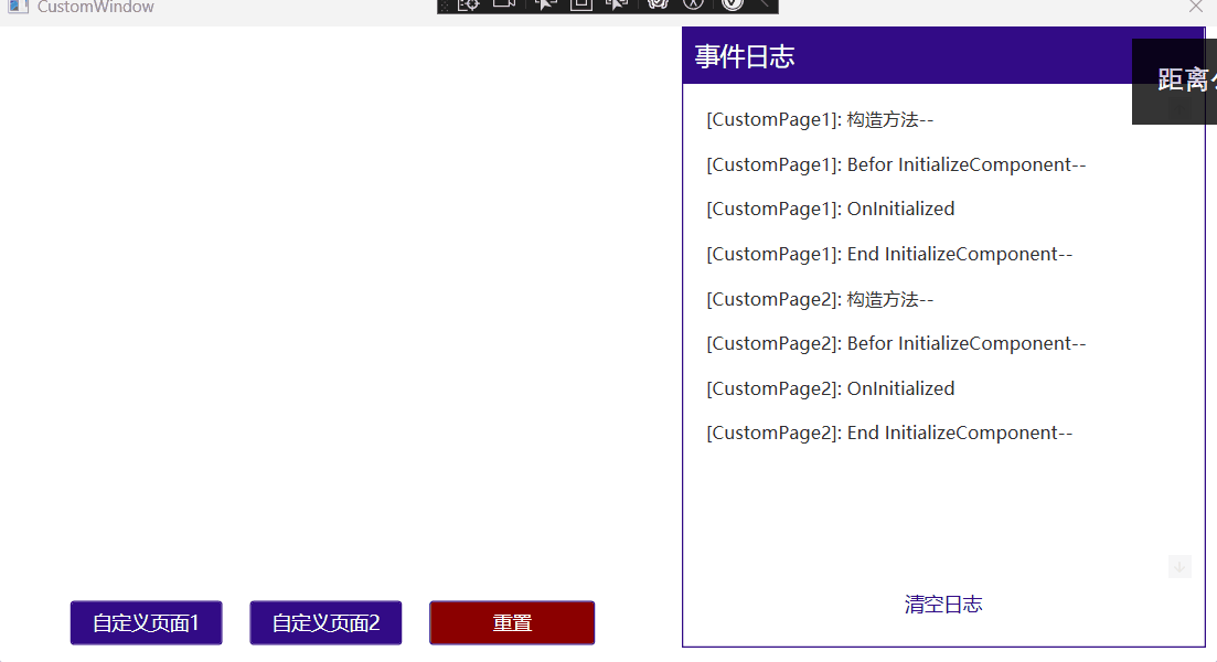
页面(Page/Windows)生命周期
以 空页面 --> Page1 --> Page2为例

ViewModel
DataContext 与 ViewModel 绑定
DataContext 是数据绑定的核心概念之一。它定义了绑定中使用的“数据源”。
当为一个控件设置了 DataContext,那么该控件内部的所有绑定都会默认使用这个上下文作为绑定源。
设置方式:
- 在 XAML 中设置
<Window.DataContext>
    <local:MyViewModel />
</Window.DataContext>- 在代码后置中设置
public MainWindow()
{
    InitializeComponent();
    this.DataContext = new MyViewModel();
}
响应式属性(Dependency properties)
控件依赖属性
WPF 控件大多使用依赖属性(而非普通的 .NET 属性)来实现响应式行为。依赖属性提供了:
- 自动支持数据绑定
- 支持动画(如 Storyboard)
- 支持样式和主题
- 支持值继承和默认值
- 提高内存效率
示例:
public class MyControl : Control
{
    public static readonly DependencyProperty TitleProperty =
        DependencyProperty.Register(
            "Title", typeof(string), typeof(MyControl), new PropertyMetadata("默认标题"));

    public string Title
    {
        get => (string)GetValue(TitleProperty);
        set => SetValue(TitleProperty, value);
    }
}
详情参考:控件封装
响应式值类型
自定义类中使用普通属性时,需要实现 INotifyPropertyChanged接口 来支持响应式更新。
WPF 的 Binding 会自动订阅 PropertyChanged 事件,只要调用 OnPropertyChanged,界面会自动刷新。
示例:
viewmodel
public class DependencyPropertiesViewModel : INotifyPropertyChanged
{

   protected void OnPropertyChanged(string name) =>
     PropertyChanged?.Invoke(this, new PropertyChangedEventArgs(name));

  private string? name;
  public string? Name
  {
      get => name;
      set
      {
          if (name != value)
          {
              name = value;
              OnPropertyChanged(nameof(Name));
          }
      }
  }

  private Gender gender;
  public Gender Gender
  {
      get => gender;
      set
      {
          if (gender != value)
          {
              gender = value;
              OnPropertyChanged(nameof(Gender));
          }
      }
  }

  public Array GenderList => Enum.GetValues(typeof(Gender));
  private int age;
  public int Age
  {
      get => age;
      set
      {
          if (age != value)
          {
              age = value;
              OnPropertyChanged(nameof(Age));
          }
      }
  }
}<Grid Width="400">
<Grid.ColumnDefinitions>
<ColumnDefinition Width="200" />
<ColumnDefinition Width="200" />
</Grid.ColumnDefinitions>
<Grid.RowDefinitions>
<RowDefinition />
<RowDefinition />
<RowDefinition />
</Grid.RowDefinitions>
<TextBox
Grid.Row="0"
Grid.Column="0"
Margin="0,5"
materialDesign:HintAssist.Hint="Name"
materialDesign:TextFieldAssist.HasClearButton="True"
Style="{StaticResource MaterialDesignOutlinedTextBox}"
Text="{Binding Name}" />
<TextBlock
Grid.Row="0"
Grid.Column="1"
HorizontalAlignment="Right"
VerticalAlignment="Center"
Text="{Binding Name}"
ToolTip="Name" />
<materialDesign:NumericUpDown
Grid.Row="1"
Grid.Column="0"
Margin="0,5"
materialDesign:HintAssist.Hint="Age"
materialDesign:TextFieldAssist.HasClearButton="True"
Style="{StaticResource MaterialDesignOutlinedNumericUpDown}"
Value="{Binding Age}" />
<TextBlock
Grid.Row="1"
Grid.Column="1"
HorizontalAlignment="Right"
VerticalAlignment="Center"
Text="{Binding Age}"
ToolTip="Age" />
<ComboBox
Grid.Row="2"
Grid.Column="0"
Margin="0,5"
materialDesign:HintAssist.Hint="Gender"
ItemsSource="{Binding GenderList}"
SelectedItem="{Binding Gender, Mode=TwoWay}"
Style="{StaticResource MaterialDesignOutlinedComboBox}" />
<TextBlock
Grid.Row="2"
Grid.Column="1"
HorizontalAlignment="Right"
VerticalAlignment="Center"
Text="{Binding Gender}"
ToolTip="Gender" />
</Grid>响应式引用类型
在 WPF 的数据绑定系统中,无论是值类型还是引用类型,如果你希望在属性值发生改变时 UI 能自动更新,你都需要通过实现 INotifyPropertyChanged 接口 来通知界面刷新。
注意
- ViewMode1实现
INotifyPropertyChanged接口后,如果是引用类型调用了PropertyChanged事件,该部分代码表示,当引用类型被替换时触发。 - 如果需要引用类型属性值发生变化时触发,引用类型也需要实现
INotifyPropertyChanged接口并在属性变化时调用PropertyChanged事件 - 如果需要属性值校验,引用类型需要实现
INotifyDataErrorInfo接口,在对应属性中添加DataAnnotations数据校验属性。并在页面订阅错误事件"{Binding XXX, ValidatesOnDataErrors=True}"。WPF会自动校验并显示错误信息。
详细示例如下:
Model
public enum Gender
{
    Male,
    Female,
    Undefined,
}

/// <summary>
/// 必须实现 INotifyPropertyChanged,否则修改属性值时无效
/// </summary>
[EnableSelection]
public class User : INotifyPropertyChanged, INotifyDataErrorInfo
{
    public event PropertyChangedEventHandler? PropertyChanged;

    protected void OnPropertyChanged(string name) =>
        PropertyChanged?.Invoke(this, new PropertyChangedEventArgs(name));

    private string? name;

    [Required(ErrorMessage = "姓名不能为空")]
    [StringLength(20, MinimumLength = 2, ErrorMessage = "姓名长度必须在 2 到 20 个字符之间")]
    [GridColumn(IsEditable = true, Label = "姓名")]
    public string? Name
    {
        get => name;
        set
        {
            if (name != value)
            {
                name = value;
                OnPropertyChanged(nameof(Name));
                ValidateProperty(value, nameof(Name));
                UserStr = ToString();
            }
        }
    }

    private int age;

    [GridColumn(IsEditable = true, Label = "年龄")]
    [Range(0, 18, ErrorMessage = "年龄必须在 0 到 120 之间")]
    public int Age
    {
        get => age;
        set
        {
            if (age != value)
            {
                age = value;
                OnPropertyChanged(nameof(Age));
                ValidateProperty(value, nameof(Age));
                UserStr = ToString();
            }
        }
    }

    [GridColumn(IsVisible = false)]
    public Array GenderList => Enum.GetValues(typeof(Gender));

    private Gender gender;

    [GridColumn(IsEditable = true, Label = "性别")]
    public Gender Gender
    {
        get => gender;
        set
        {
            if (gender != value)
            {
                gender = value;
                OnPropertyChanged(nameof(Gender));
                UserStr = ToString();
            }
        }
    }

    public override string? ToString()
    {
        return $"Name:{Name}; Age:{Age}; Gender:{Gender}; ";
    }

    private string? userStr;

    [GridColumn(IsVisible = false)]
    public string? UserStr
    {
        get => userStr;
        set
        {
            if (userStr != value)
            {
                userStr = value;
                OnPropertyChanged(nameof(userStr));
            }
        }
    }

    /// <summary>
    /// 可以放在ModelBase中
    /// 1. 需要实现INotifyDataErrorInfo接口
    /// 2. 需要View Binding Name, ValidatesOnDataErrors=True
    ///
    /// 过程:
    ///
    /// 用户输入 --> TextBox.Text --> Binding --> ViewModel 属性 set
    ///     ↓
    /// 执行验证逻辑
    ///     ↓
    /// 错误字典更新(_errors[propertyName] = [...])
    ///     ↓
    /// 触发 ErrorsChanged 事件
    ///     ↓
    /// WPF Binding 收到通知,调用 GetErrors(propertyName)
    ///     ↓
    /// Validation.Errors 更新 (控件默认含有 Validation.ErrorTemplate)
    ///     ↓
    /// UI(MaterialDesign) 显示或清除错误提示
    /// ValidationAssist.UsePopup="True" → 气泡提示(错误显示在控件旁边)
    /// ValidationAssist.UsePopup="False"(默认)→ 错误显示在控件下方
    ///
    /// </summary>
    #region Validation
    private readonly Dictionary<string, List<string>> _errors = [];

    public bool HasErrors => _errors.Count != 0;
    public event EventHandler<DataErrorsChangedEventArgs>? ErrorsChanged;

    IEnumerable INotifyDataErrorInfo.GetErrors(string? propertyName)
    {
        if (string.IsNullOrEmpty(propertyName))
            return new List<string>();
        return _errors.TryGetValue(propertyName, out List<string>? value) ? value : [];
    }

    private void ValidateProperty(object? value, string propertyName)
    {
        ClearErrors(propertyName);

        var context = new ValidationContext(this) { MemberName = propertyName };
        var results = new List<ValidationResult>();

        if (!Validator.TryValidateProperty(value, context, results))
        {
            _errors[propertyName] = results.Select(r => r.ErrorMessage ?? "").ToList();
            OnErrorsChanged(propertyName);
        }
    }

    private void ClearErrors(string propertyName)
    {
        if (_errors.Remove(propertyName))
        {
            OnErrorsChanged(propertyName);
        }
    }

    private void OnErrorsChanged(string propertyName) =>
        ErrorsChanged?.Invoke(this, new DataErrorsChangedEventArgs(propertyName));

    #endregion
}
ViewModel
public class DependencyPropertiesViewModel : INotifyPropertyChanged
{
  public event PropertyChangedEventHandler? PropertyChanged;

  protected void OnPropertyChanged(string name) =>
      PropertyChanged?.Invoke(this, new PropertyChangedEventArgs(name));

  /// <summary>
  /// 如果user没有实现 INotifyPropertyChanged,则只有替换user时才会更新页面
  /// </summary>
  private User user = new User { Name = "Seven Chen", Age = 20 };
  public User User
  {
      get => user;
      set
      {
          user = value;
          OnPropertyChanged(nameof(User));
      }
  }
}
UI
<StackPanel
    Width="400"
    VerticalAlignment="Top"
    Orientation="Vertical">

    <Grid DataContext="{Binding User}">
        <Grid.ColumnDefinitions>
            <ColumnDefinition />
            <ColumnDefinition />
        </Grid.ColumnDefinitions>
        <Grid.RowDefinitions>
            <RowDefinition />
            <RowDefinition />
            <RowDefinition />
        </Grid.RowDefinitions>
        <TextBlock
            Grid.Row="0"
            Grid.Column="0"
            VerticalAlignment="Center"
            Text="Name:" />
        <TextBox
            Grid.Row="0"
            Grid.Column="1"
            Margin="0,5"
            materialDesign:HintAssist.Hint="Name"
            materialDesign:TextFieldAssist.HasClearButton="True"
            materialDesign:ValidationAssist.UsePopup="True"
            Style="{StaticResource MaterialDesignOutlinedTextBox}"
            Text="{Binding Name, ValidatesOnDataErrors=True}" />
        <TextBlock
            Grid.Row="1"
            Grid.Column="0"
            VerticalAlignment="Center"
            Text="Age:" />
        <materialDesign:NumericUpDown
            Grid.Row="1"
            Grid.Column="1"
            Margin="0,5"
            VerticalAlignment="Center"
            materialDesign:TextFieldAssist.HasClearButton="True"
            materialDesign:ValidationAssist.UsePopup="False"
            Style="{StaticResource MaterialDesignOutlinedNumericUpDown}"
            Value="{Binding Age, ValidatesOnDataErrors=True}" />
        <TextBlock
            Grid.Row="2"
            Grid.Column="0"
            VerticalAlignment="Center"
            Text="Gender:" />
        <ComboBox
            Grid.Row="2"
            Grid.Column="1"
            Margin="0,5"
            materialDesign:HintAssist.HelperText="Choose Gender"
            materialDesign:HintAssist.Hint="Gender"
            ItemsSource="{Binding GenderList}"
            SelectedItem="{Binding Gender, Mode=TwoWay}"
            Style="{StaticResource MaterialDesignOutlinedComboBox}" />
    </Grid>
    <Border
        Margin="0,10"
        Padding="20"
        Background="LightGray">
        <TextBlock Text="{Binding User.UserStr}" />
    </Border>

</StackPanel>
响应式集合
注意
- 响应式集合同样需要调用了
PropertyChanged事件通知页面,但这部分只有在集合整体替换时触发。 - 响应式集合同时还需要
ObservableCollection来实现集合的增删改查的监听和触发,ObservableCollection内部实现了PropertyChanged事件通知。 - 如果集合内是引用类型数据,则需要引用类型也实现
PropertyChanged事件,否则无法在修改集合单个实例属性变化的监听。
ViewModel
private ObservableCollection<User> users =
[
    new User
    {
        Name = "张三",
        Age = 16,
        Gender = Gender.Male,
    },
    new User
    {
        Name = "李四",
        Age = 17,
        Gender = Gender.Female,
    },
    new User
    {
        Name = "王五",
        Age = 18,
        Gender = Gender.Male,
    },
    new User
    {
        Name = "刘六",
        Age = 19,
        Gender = Gender.Female,
    },
];

public ObservableCollection<User> Users
{
    get => users;
    set
    {
        users = value;
        OnPropertyChanged(nameof(users));
    }
}
命令(Command)
Command(命令) 是一种把 用户交互(UI 层) 与 执行逻辑(逻辑层) 解耦的机制。
所有命令实现都基于 ICommand 接口。
常见的命令类型:
- RelayCommand (MVVM 中的命令)
- AsyncRelayCommand (MVVM 中的异步命令)
- RoutedCommand (路由命令)
- RoutedUICommand (路由命令-相对RoutedCommand可以绑定Text )
ICommand
public interface ICommand
{
    event EventHandler? CanExecuteChanged;
    bool CanExecute(object? parameter);
    void Execute(object? parameter);
}- Execute:执行命令的动作
- CanExecute:是否允许执行(比如“保存”按钮没有数据就禁用)
- CanExecuteChanged:当执行条件变化时通知 UI 刷新
其中最常见的实现有
- RelayCommand (MVVM 中的命令)
- AsyncRelayCommand (MVVM 中的异步命令)
示例:
ViewModel
public partial class CommandViewModel : ViewModelBase
{
  public CommandViewModel(CommandService service)
  {
      CustomCommand = new RelayCommand(() =>
      {
          MessageBox.Show("同步已点击");
      });

      CustomCommand2 = new AsyncRelayCommand(async () =>
      {
          await Task.Delay(2000);
          await Task.Run(() =>
          {
              MessageBox.Show($"异步按钮已点击");
          });
      });

      //Age > 0 时可以执行
      MinusCommand = new RelayCommand(() => Age--);
      //Age < 20 时可以执行
      PlusCommand = new RelayCommand(() => Age++);

      //Age > 0 时可以执行
      MinusCommand1 = new RelayCommand(() => Age1--, () => Age1 > 0);
      //Age < 20 时可以执行
      PlusCommand1 = new RelayCommand(() => Age1++, () => Age1 < 20);

      //Age > 0 时可以执行, 其他条件禁用按钮
      MinusCommand2 = new RelayCommand(() => Age2--, () => Age2 > 0);
      //Age < 20 时可以执行, 其他条件禁用按钮
      PlusCommand2 = new RelayCommand(() => Age2++, () => Age2 < 20);

      //Age > 0 时可以执行, 其他条件禁用按钮
      MinusCommand3 = new RelayCommandImplementation(_ => Age3--, _ => Age3 > 0);
      //Age < 20 时可以执行, 其他条件禁用按钮
      PlusCommand3 = new RelayCommandImplementation(_ => Age3++, _ => Age3 < 20);

      //固定参数
      TestParaCommand = new RelayCommand<string>(TestPara);
      //单个参数
      TestParaCommand1 = new RelayCommand<string>(TestPara1);
      //对个参数
      TestParaCommand2 = new RelayCommand<(string Name, string Age)>(TestPara2);
      //对象参数
      TestParaCommand3 = new RelayCommand<User>(TestPara3);
  }

  public ICommand CustomCommand { get; }
  public ICommand CustomCommand2 { get; }

  [ObservableProperty]
  private int age = 0;
  public ICommand MinusCommand { get; }
  public ICommand PlusCommand { get; }

  /// <summary>
  /// 不会通知变更,控件禁用状态无法更新
  /// </summary>
  [ObservableProperty]
  private int age1 = 0;
  public ICommand MinusCommand1 { get; }
  public ICommand PlusCommand1 { get; }

  /// <summary>
  /// 通知变更,控件禁用在Age变化时更新
  /// </summary>
  private int _age2 = 0;
  public int Age2
  {
      get => _age2;
      set
      {
          SetProperty(ref _age2, value);
          //通知变更
          ((RelayCommand)MinusCommand2).NotifyCanExecuteChanged();
          ((RelayCommand)PlusCommand2).NotifyCanExecuteChanged();
      }
  }
  public ICommand MinusCommand2 { get; }
  public ICommand PlusCommand2 { get; }

  /// <summary>
  /// 使用封装的RelayCommandImplementation(注册CanExecuteChanged事件)通知变更,控件禁用在Age变化时更新
  /// </summary>
  [ObservableProperty]
  private int age3 = 0;
  public ICommand MinusCommand3 { get; }
  public ICommand PlusCommand3 { get; }

  public ICommand TestParaCommand { get; }

  private void TestPara(string? para)
  {
      MessageBox.Show($"固定参数:{para}");
  }

  public ICommand TestParaCommand1 { get; }

  private void TestPara1(string? para)
  {
      MessageBox.Show($"单个参数:{para}");
  }

  public ICommand TestParaCommand2 { get; }

  private void TestPara2((string Name, string Age) param)
  {
      MessageBox.Show($"多个个参数:姓名: {param.Name}, 年龄: {param.Age}");
  }

  [ObservableProperty]
  private ObservableCollection<User> users =
  [
      new User
      {
          Name = "张三",
          Age = 16,
          Gender = Gender.Male,
      },
      new User
      {
          Name = "李四",
          Age = 17,
          Gender = Gender.Female,
      },
      new User
      {
          Name = "王五",
          Age = 18,
          Gender = Gender.Male,
      },
      new User
      {
          Name = "刘六",
          Age = 19,
          Gender = Gender.Female,
      },
  ];
  public ICommand TestParaCommand3 { get; }

  private void TestPara3(User? param)
  {
      MessageBox.Show($"对象参数:{param?.ToString() ?? ""}");
  }
}
UI
 <Grid>
     <Grid.ColumnDefinitions>
         <ColumnDefinition />
         <ColumnDefinition />
     </Grid.ColumnDefinitions>
     <StackPanel
         Grid.Column="0"
         Width="400"
         Margin="10"
         VerticalAlignment="Top"
         Orientation="Vertical">
         <Button
             Height="40"
             Margin="10,5"
             Command="{Binding CustomCommand}"
             CommandParameter="Hello World"
             Content="同步按钮"
             Style="{StaticResource MaterialDesignRaisedDarkButton}" />
         <Button
             Height="40"
             Margin="10,5"
             Command="{Binding CustomCommand2}"
             Content="异步按钮"
             Style="{StaticResource MaterialDesignRaisedDarkButton}" />
         <Grid>
             <Grid.ColumnDefinitions>
                 <ColumnDefinition Width="40" />
                 <ColumnDefinition />
                 <ColumnDefinition Width="40" />
             </Grid.ColumnDefinitions>
             <Button
                 Grid.Column="0"
                 Width="30"
                 Height="30"
                 Command="{Binding MinusCommand}"
                 Content="{materialDesign:PackIcon Kind=Minus,
                                                   Size=24}"
                 Style="{StaticResource MaterialDesignIconForegroundButton}"
                 ToolTip="减" />
             <materialDesign:NumericUpDown
                 Grid.Column="1"
                 Margin="10,15"
                 Style="{StaticResource MaterialDesignOutlinedNumericUpDown}"
                 Value="{Binding Age}" />
             <Button
                 Grid.Column="2"
                 Width="30"
                 Height="30"
                 Command="{Binding PlusCommand}"
                 Content="{materialDesign:PackIcon Kind=Plus,
                                                   Size=24}"
                 Style="{StaticResource MaterialDesignIconForegroundButton}"
                 ToolTip="减" />
         </Grid>

         <Grid>
             <Grid.ColumnDefinitions>
                 <ColumnDefinition Width="40" />
                 <ColumnDefinition />
                 <ColumnDefinition Width="40" />
             </Grid.ColumnDefinitions>
             <Button
                 Grid.Column="0"
                 Width="30"
                 Height="30"
                 Command="{Binding MinusCommand1}"
                 Content="{materialDesign:PackIcon Kind=Minus,
                                                   Size=24}"
                 Style="{StaticResource MaterialDesignIconForegroundButton}"
                 ToolTip="减" />
             <materialDesign:NumericUpDown
                 Grid.Column="1"
                 Margin="10,15"
                 Style="{StaticResource MaterialDesignOutlinedNumericUpDown}"
                 Value="{Binding Age1}" />
             <Button
                 Grid.Column="2"
                 Width="30"
                 Height="30"
                 Command="{Binding PlusCommand1}"
                 Content="{materialDesign:PackIcon Kind=Plus,
                                                   Size=24}"
                 Style="{StaticResource MaterialDesignIconForegroundButton}"
                 ToolTip="减" />
         </Grid>

         <Grid>
             <Grid.ColumnDefinitions>
                 <ColumnDefinition Width="40" />
                 <ColumnDefinition />
                 <ColumnDefinition Width="40" />
             </Grid.ColumnDefinitions>
             <Button
                 Grid.Column="0"
                 Width="30"
                 Height="30"
                 Command="{Binding MinusCommand2}"
                 Content="{materialDesign:PackIcon Kind=Minus,
                                                   Size=24}"
                 Style="{StaticResource MaterialDesignIconForegroundButton}"
                 ToolTip="减" />
             <materialDesign:NumericUpDown
                 Grid.Column="1"
                 Margin="10,15"
                 Style="{StaticResource MaterialDesignOutlinedNumericUpDown}"
                 Value="{Binding Age2}" />
             <Button
                 Grid.Column="2"
                 Width="30"
                 Height="30"
                 Command="{Binding PlusCommand2}"
                 Content="{materialDesign:PackIcon Kind=Plus,
                                                   Size=24}"
                 Style="{StaticResource MaterialDesignIconForegroundButton}"
                 ToolTip="减" />
         </Grid>

         <Grid>
             <Grid.ColumnDefinitions>
                 <ColumnDefinition Width="40" />
                 <ColumnDefinition />
                 <ColumnDefinition Width="40" />
             </Grid.ColumnDefinitions>
             <Button
                 Grid.Column="0"
                 Width="30"
                 Height="30"
                 Command="{Binding MinusCommand3}"
                 Content="{materialDesign:PackIcon Kind=Minus,
                                                   Size=24}"
                 Style="{StaticResource MaterialDesignIconForegroundButton}"
                 ToolTip="减" />
             <materialDesign:NumericUpDown
                 Grid.Column="1"
                 Margin="10,15"
                 Style="{StaticResource MaterialDesignOutlinedNumericUpDown}"
                 Value="{Binding Age3}" />
             <Button
                 Grid.Column="2"
                 Width="30"
                 Height="30"
                 Command="{Binding PlusCommand3}"
                 Content="{materialDesign:PackIcon Kind=Plus,
                                                   Size=24}"
                 Style="{StaticResource MaterialDesignIconForegroundButton}"
                 ToolTip="减" />
         </Grid>
     </StackPanel>
     <StackPanel
         Grid.Column="1"
         Width="400"
         Margin="10"
         VerticalAlignment="Top"
         Orientation="Vertical">
         <Button
             Height="40"
             Margin="10,5"
             Command="{Binding TestParaCommand}"
             CommandParameter="Hello World"
             Content="固定参数"
             Style="{StaticResource MaterialDesignRaisedDarkButton}" />
         <Grid>
             <Grid.ColumnDefinitions>
                 <ColumnDefinition />
                 <ColumnDefinition Width="200" />
             </Grid.ColumnDefinitions>
             <!--  动态参数(绑定 TextBox 的值)  -->
             <TextBox
                 x:Name="InputBox"
                 Grid.Column="0"
                 Margin="10,5"
                 Style="{StaticResource MaterialDesignOutlinedTextBox}" />
             <Button
                 Grid.Column="1"
                 Height="40"
                 Margin="10,5"
                 Command="{Binding TestParaCommand1}"
                 CommandParameter="{Binding Text, ElementName=InputBox}"
                 Content="传单个参数"
                 Style="{StaticResource MaterialDesignRaisedDarkButton}" />
         </Grid>

         <Grid Margin="10,5">
             <Grid.RowDefinitions>
                 <RowDefinition />
                 <RowDefinition />
             </Grid.RowDefinitions>
             <Grid.ColumnDefinitions>
                 <ColumnDefinition />
                 <ColumnDefinition />
             </Grid.ColumnDefinitions>
             <TextBox
                 x:Name="NameBox"
                 Grid.Row="0"
                 Grid.Column="0"
                 Margin="0,15"
                 materialDesign:HintAssist.Hint="Name"
                 Style="{StaticResource MaterialDesignOutlinedTextBox}" />
             <materialDesign:NumericUpDown
                 x:Name="AgeBox"
                 Grid.Row="0"
                 Grid.Column="1"
                 Margin="10,15"
                 Style="{StaticResource MaterialDesignOutlinedNumericUpDown}" />
             <Button
                 Grid.Row="1"
                 Grid.ColumnSpan="2"
                 Height="40"
                 Margin="0,15"
                 Command="{Binding TestParaCommand2}"
                 Content="传多个参数"
                 Style="{StaticResource MaterialDesignRaisedDarkButton}">
                 <Button.CommandParameter>
                     <MultiBinding Converter="{StaticResource MultiParamConverter}">
                         <Binding ElementName="NameBox" Path="Text" />
                         <Binding ElementName="AgeBox" Path="Value" />
                     </MultiBinding>
                 </Button.CommandParameter>
             </Button>
         </Grid>

         <StackPanel
             Margin="10,5"
             VerticalAlignment="Top"
             Orientation="Vertical">
             <DataGrid
                 x:Name="Users"
                 AutoGenerateColumns="True"
                 CanUserAddRows="False"
                 ItemsSource="{Binding Users}" />

             <Button
                 Height="40"
                 Command="{Binding TestParaCommand3}"
                 CommandParameter="{Binding SelectedItem, ElementName=Users}"
                 Content="传对象参数"
                 Style="{StaticResource MaterialDesignRaisedDarkButton}" />
         </StackPanel>
     </StackPanel>

 </Grid>
提示
如果需要控件获取
CanExecute信息需要 每次修改时调用NotifyCanExecuteChanged()通知。 想要简化过程,可以简单封装:RelayCommandImplementation
csharppublic class RelayCommandImplementation : ICommand { private readonly Action<object?> _execute; private readonly Func<object?, bool> _canExecute; public RelayCommandImplementation(Action<object?> execute) : this(execute, null) { } public RelayCommandImplementation(Action<object?> execute, Func<object?, bool>? canExecute) { ArgumentNullException.ThrowIfNull(execute); _execute = execute; _canExecute = canExecute ?? (x => true); } public bool CanExecute(object? parameter) => _canExecute(parameter); public void Execute(object? parameter) => _execute(parameter); /// <summary>\ /// Button、MenuItem 等控件在绑定 Command 时,会:订阅ICommand.CanExecuteChanged 事件(调用上面的 add 语句) /// 实际上就是把 刷新逻辑订阅到了 CommandManager.RequerySuggested /// CommandManager 会在这些时机触发 RequerySuggested: /// - UI 有输入焦点变化 /// - 鼠标键盘事件后 /// - 你手动调用 CommandManager.InvalidateRequerySuggested [Refresh()] /// 触发后,WPF 会自动遍历所有订阅 RequerySuggested 的事件处理器,调用它们,从而触发控件重新执行 CanExecute。 /// </summary> public event EventHandler? CanExecuteChanged { add { CommandManager.RequerySuggested += value; } remove { CommandManager.RequerySuggested -= value; } } public void Refresh() { CommandManager.InvalidateRequerySuggested(); } }可以使用泛型命令实现传参
RoutedCommand
自定义RoutedCommand/RoutedUICommand示例:
- 全局绑定键盘事件
CustomCommands
 public static class TestCustomCommands
 {
     //普通 RoutedCommand(不带 UI 文本)
     public static readonly RoutedCommand SimpleCommand = new(
         "ShowSimpleMessage", // 命令名称
         typeof(TestCustomCommands),
         [
             new KeyGesture(Key.B, ModifierKeys.Control), // Ctrl+B
         ]
     );

     //普通 RoutedCommand(不带 UI 文本)
     public static readonly RoutedCommand ExitCommand = new(
         "ExitCommand", // 命令名称
         typeof(TestCustomCommands),
         [
             new KeyGesture(Key.E, ModifierKeys.Control), // Ctrl+B
         ]
     );

     //普通 RoutedCommand(不带 UI 文本)
     public static readonly RoutedCommand GlobalCommand = new(
         "GlobalCommand", // 命令名称
         typeof(TestCustomCommands),
         [
             new KeyGesture(Key.G, ModifierKeys.Control | ModifierKeys.Alt), // Ctrl+Alt+G
         ]
     );

     //带 UI 文本 + 快捷键的 RoutedUICommand
     public static readonly RoutedUICommand ShowMessageCommand = new(
         "Control + M", // UI(菜单、按钮等绑定时) 显示文本
         "ShowMessage", // 命令名称
         typeof(TestCustomCommands),
         [
             new KeyGesture(Key.M, ModifierKeys.Control), // Ctrl+M
         ]
     );
 }
全局注册:
MainWindow.xaml
<Window.CommandBindings>
    <!--  RoutedCommand  -->
    <CommandBinding
        CanExecute="SimpleCommand_CanExecute"
        Command="{x:Static customCommands:TestCustomCommands.SimpleCommand}"
        Executed="SimpleCommand_Executed" />

    <!--  RoutedCommand  -->
    <CommandBinding
        CanExecute="ExitCommand_CanExecute"
        Command="{x:Static customCommands:TestCustomCommands.ExitCommand}"
        Executed="ExitCommand_Executed" />


    <!--  RoutedUICommand  -->
    <CommandBinding
        CanExecute="ShowMessageCommand_CanExecute"
        Command="{x:Static customCommands:TestCustomCommands.ShowMessageCommand}"
        Executed="ShowMessageCommand_Executed" />
</Window.CommandBindings>private void SimpleCommand_Executed(object sender, ExecutedRoutedEventArgs e)
{
MessageBox.Show("RoutedCommand 执行了!");
}
private void SimpleCommand_CanExecute(object sender, CanExecuteRoutedEventArgs e)
{
e.CanExecute = true; // 启用命令
}
private void ExitCommand_Executed(object sender, ExecutedRoutedEventArgs e)
{
if (
MessageBox.Show("确认退出?", "退出", MessageBoxButton.OKCancel)
== MessageBoxResult.OK
)
{
Application.Current.Shutdown();
}
}
private void ExitCommand_CanExecute(object sender, CanExecuteRoutedEventArgs e)
{
e.CanExecute = true; // 启用命令
}
// RoutedUICommand 逻辑
private void ShowMessageCommand_Executed(object sender, ExecutedRoutedEventArgs e)
{
MessageBox.Show("RoutedUICommand 执行了!(可用 Ctrl+M 快捷键)");
}
private void ShowMessageCommand_CanExecute(object sender, CanExecuteRoutedEventArgs e)
{
e.CanExecute = true; // 启用命令
}也可以按钮绑定
<Button
    Width="600"
    Height="40"
    Margin="10,5"
    Command="{x:Static customCommands:TestCustomCommands.SimpleCommand}"
    Content="执行 RoutedCommand"
    Style="{StaticResource MaterialDesignRaisedDarkButton}" />
<TextBlock
    HorizontalAlignment="Center"
    FontSize="14"
    Foreground="Gray"
    Text="提示:按 Ctrl+B 可触发 '显示消息' 命令(全局)" />

<!--  需要手动绑定Text  -->
<Button
    Width="600"
    Height="40"
    Margin="10,5"
    Command="{x:Static customCommands:TestCustomCommands.ShowMessageCommand}"
    Content="{Binding RelativeSource={RelativeSource Self}, Path=Command.Text}"
    Style="{StaticResource MaterialDesignRaisedDarkButton}" />

<TextBlock
    HorizontalAlignment="Center"
    FontSize="14"
    Foreground="Gray"
    Text="提示:按 Ctrl+M 可触发 '显示消息' 命令(全局)。相对RoutedCommand可以绑定绑定Text " />
提示
不推荐绑定在子控件中,需要获得焦点才能生效
全局绑定是指绑定到视觉树,最小化窗口会导致快捷键失效。如果需要windows级别的注册,需要Win32 API 注册全局热键:
csharp//Win32 API 注册全局热键 [DllImport("user32.dll")] private static extern bool RegisterHotKey(IntPtr hWnd, int id, uint fsModifiers, uint vk); [DllImport("user32.dll")] private static extern bool UnregisterHotKey(IntPtr hWnd, int id); const uint MOD_ALT = 0x0001; // Alt const uint MOD_CONTROL = 0x0002; // Ctrl const uint MOD_SHIFT = 0x0004; // SHIFT const int HOTKEY_ID = 19000; protected override void OnSourceInitialized(EventArgs e) { base.OnSourceInitialized(e); var helper = new WindowInteropHelper(this); RegisterHotKey( helper.Handle, HOTKEY_ID, MOD_CONTROL | MOD_ALT, (uint)System.Windows.Forms.Keys.G ); // Ctrl+Alt+G HwndSource source = HwndSource.FromHwnd(helper.Handle); source.AddHook(HwndHook); } private IntPtr HwndHook( IntPtr hwnd, int msg, IntPtr wParam, IntPtr lParam, ref bool handled ) { const int WM_HOTKEY = 0x0312; if (msg == WM_HOTKEY && wParam.ToInt32() == HOTKEY_ID) { MessageBox.Show("全局热键触发,窗口即使最小化也能执行"); handled = true; } return IntPtr.Zero; } protected override void OnClosed(EventArgs e) { var helper = new WindowInteropHelper(this); UnregisterHotKey(helper.Handle, HOTKEY_ID); base.OnClosed(e); }
内置RoutedUICommand示例
<Border
    Height="600"
    Margin="5"
    Padding="10"
    BorderBrush="Black"
    BorderThickness="1">
    <DockPanel>
        <!--  菜单栏  -->
        <Menu DockPanel.Dock="Top">
            <MenuItem Header="_File">
                <MenuItem
                    Command="ApplicationCommands.Open"
                    Header="Open"
                    Icon="{materialDesign:PackIcon Kind=File}" />
                <MenuItem
                    Command="ApplicationCommands.Save"
                    Header="Save As.."
                    Icon="{materialDesign:PackIcon Kind=ContentSaveAll}" />
                <MenuItem
                    Command="{x:Static customCommands:TestCustomCommands.ExitCommand}"
                    Header="Exit"
                    Icon="{materialDesign:PackIcon Kind=ExitToApp}"
                    InputGestureText="Ctrl+E" />
                <MenuItem
                    Command="ApplicationCommands.Print"
                    Header="Print"
                    Icon="{materialDesign:PackIcon Kind=Printer}" />
                <Separator />
                <MenuItem
                    Command="ApplicationCommands.Help"
                    Header="_Help"
                    Icon="{materialDesign:PackIcon Kind=Help}" />
            </MenuItem>
            <MenuItem Header="_Edit">
                <MenuItem Command="ApplicationCommands.SelectAll" Icon="{materialDesign:PackIcon Kind=SelectAll}" />
                <Separator />
                <MenuItem
                    Command="ApplicationCommands.Cut"
                    Header="_Cut"
                    Icon="{materialDesign:PackIcon Kind=ContentCut}" />
                <MenuItem
                    Command="ApplicationCommands.Copy"
                    Header="_Copy"
                    Icon="{materialDesign:PackIcon Kind=ContentCopy}" />
                <MenuItem
                    Command="ApplicationCommands.Paste"
                    Header="_Paste"
                    Icon="{materialDesign:PackIcon Kind=ContentPaste}" />
                <Separator />
                <MenuItem
                    Command="ApplicationCommands.Undo"
                    Header="Undo"
                    Icon="{materialDesign:PackIcon Kind=Undo}" />
                <MenuItem
                    Command="ApplicationCommands.Redo"
                    Header="Redo"
                    Icon="{materialDesign:PackIcon Kind=Redo}" />

            </MenuItem>
        </Menu>


        <!--  编辑区  -->
        <!--<RichTextBox
            Name="editor"
            Height="500"
            Margin="10"
            VerticalAlignment="Top"
            AcceptsReturn="True"
            Style="{StaticResource MaterialDesignOutlinedRichTextBox}"
            VerticalScrollBarVisibility="Auto" />-->
        <DockPanel Name="mainPanel">

            <!--  This tool bar contains all the editing buttons.  -->
            <ToolBarTray DockPanel.Dock="Top">
                <ToolBar
                    Name="mainToolBar"
                    Height="30"
                    DockPanel.Dock="Top"
                    Style="{StaticResource MaterialDesignToolBar}">
                    <Button
                        Command="ApplicationCommands.SelectAll"
                        Style="{StaticResource MaterialDesignIconButton}"
                        ToolTip="Cut">
                        <materialDesign:PackIcon Kind="SelectAll" />
                    </Button>
                    <Button
                        Command="ApplicationCommands.Cut"
                        Style="{StaticResource MaterialDesignIconButton}"
                        ToolTip="Cut">
                        <materialDesign:PackIcon Kind="ContentCut" />
                    </Button>
                    <Button
                        Command="ApplicationCommands.Copy"
                        Style="{StaticResource MaterialDesignIconButton}"
                        ToolTip="Copy">
                        <materialDesign:PackIcon Kind="ContentCopy" />
                    </Button>
                    <Button
                        Command="ApplicationCommands.Paste"
                        Style="{StaticResource MaterialDesignIconButton}"
                        ToolTip="Paste">
                        <materialDesign:PackIcon Kind="ContentPaste" />
                    </Button>
                    <Button
                        Command="ApplicationCommands.Undo"
                        Style="{StaticResource MaterialDesignIconButton}"
                        ToolTip="Undo">
                        <materialDesign:PackIcon Kind="Undo" />
                    </Button>
                    <Button
                        Command="ApplicationCommands.Redo"
                        Style="{StaticResource MaterialDesignIconButton}"
                        ToolTip="Redo">
                        <materialDesign:PackIcon Kind="Redo" />
                    </Button>

                    <Button
                        Command="EditingCommands.ToggleBold"
                        Style="{StaticResource MaterialDesignIconButton}"
                        ToolTip="Bold">
                        <TextBlock FontWeight="Bold">B</TextBlock>
                    </Button>
                    <Button
                        Command="EditingCommands.ToggleItalic"
                        Style="{StaticResource MaterialDesignIconButton}"
                        ToolTip="Italic">
                        <TextBlock FontStyle="Italic" FontWeight="Bold">I</TextBlock>
                    </Button>
                    <Button
                        Command="EditingCommands.ToggleUnderline"
                        Style="{StaticResource MaterialDesignIconButton}"
                        ToolTip="Underline">
                        <TextBlock FontWeight="Bold" TextDecorations="Underline">U</TextBlock>
                    </Button>
                    <Button
                        Command="EditingCommands.IncreaseFontSize"
                        Style="{StaticResource MaterialDesignIconButton}"
                        ToolTip="Grow Font">
                        <materialDesign:PackIcon Kind="Increment" />
                    </Button>
                    <Button
                        Command="EditingCommands.DecreaseFontSize"
                        Style="{StaticResource MaterialDesignIconButton}"
                        ToolTip="Shrink Font">
                        <materialDesign:PackIcon Kind="Decrement" />
                    </Button>

                    <Button
                        Command="EditingCommands.ToggleBullets"
                        Style="{StaticResource MaterialDesignIconButton}"
                        ToolTip="Bullets">
                        <materialDesign:PackIcon Kind="FormatListBulleted" />
                    </Button>
                    <Button
                        Command="EditingCommands.ToggleNumbering"
                        Style="{StaticResource MaterialDesignIconButton}"
                        ToolTip="Numbering">
                        <materialDesign:PackIcon Kind="Numeric" />
                    </Button>
                    <Button
                        Command="EditingCommands.AlignLeft"
                        Style="{StaticResource MaterialDesignIconButton}"
                        ToolTip="Align Left">
                        <materialDesign:PackIcon Kind="AlignHorizontalLeft" />
                    </Button>
                    <Button
                        Command="EditingCommands.AlignCenter"
                        Style="{StaticResource MaterialDesignIconButton}"
                        ToolTip="Align Center">
                        <materialDesign:PackIcon Kind="AlignHorizontalCenter" />
                    </Button>
                    <Button
                        Command="EditingCommands.AlignRight"
                        Style="{StaticResource MaterialDesignIconButton}"
                        ToolTip="Align Right">
                        <materialDesign:PackIcon Kind="AlignHorizontalRight" />
                    </Button>
                    <Button
                        Command="EditingCommands.AlignJustify"
                        Style="{StaticResource MaterialDesignIconButton}"
                        ToolTip="Align Justify">
                        <materialDesign:PackIcon Kind="AlignHorizontalDistribute" />
                    </Button>
                    <Button
                        Command="EditingCommands.IncreaseIndentation"
                        Style="{StaticResource MaterialDesignIconButton}"
                        ToolTip="Increase Indent">
                        <materialDesign:PackIcon Kind="ArrowCollapseRight" />
                    </Button>
                    <Button
                        Command="EditingCommands.DecreaseIndentation"
                        Style="{StaticResource MaterialDesignIconButton}"
                        ToolTip="Decrease Indent">
                        <materialDesign:PackIcon Kind="ArrowCollapseLeft" />
                    </Button>
                </ToolBar>
            </ToolBarTray>

            <!--
                By default pressing tab moves focus to the next control. Setting AcceptsTab to true allows the
                RichTextBox to accept tab characters.
            -->
            <RichTextBox
                Name="mainRTB"
                VerticalContentAlignment="Top"
                AcceptsReturn="True"
                AcceptsTab="True"
                IsDocumentEnabled="True"
                SpellCheck.IsEnabled="True"
                VerticalScrollBarVisibility="Auto" />
        </DockPanel>
    </DockPanel>
</Border>using System.IO;
using System.Windows;
using System.Windows.Controls;
using System.Windows.Documents;
using System.Windows.Input;
using System.Windows.Media;
namespace WpfDemo.Views.Pages
{
/// <summary>
/// Command.xaml 的交互逻辑
/// </Command>
public partial class Command : UserControl
{
public Command()
{
InitializeComponent();
CommandBindings.Add(
new CommandBinding(
ApplicationCommands.Open,
Open_Executed,
(s, e) =>
{
e.CanExecute = true;
}
)
);
CommandBindings.Add(
new CommandBinding(
ApplicationCommands.Save,
Save_Executed,
(s, e) =>
{
e.CanExecute = true;
}
)
);
CommandBindings.Add(
new CommandBinding(
ApplicationCommands.Print,
Print_Executed,
(s, e) =>
{
e.CanExecute = true;
}
)
);
}
private void Open_Executed(object sender, ExecutedRoutedEventArgs e)
{
System.Windows.Forms.OpenFileDialog dlg = new System.Windows.Forms.OpenFileDialog
{
Filter = "RTF 文件 (*.rtf)|*.rtf|所有文件 (*.*)|*.*",
};
if (dlg.ShowDialog() == System.Windows.Forms.DialogResult.OK)
{
using FileStream fs = new(dlg.FileName, FileMode.Open);
TextRange range = new(mainRTB.Document.ContentStart, mainRTB.Document.ContentEnd);
range.Load(fs, DataFormats.Rtf); // 加载到 RichTextBox
}
}
private void Save_Executed(object sender, ExecutedRoutedEventArgs e)
{
System.Windows.Forms.SaveFileDialog dlg = new System.Windows.Forms.SaveFileDialog
{
Filter = "RTF 文件 (*.rtf)|*.rtf|所有文件 (*.*)|*.*",
DefaultExt = ".rtf", // 默认扩展名
FileName = "新文档.rtf", // 默认文件名
InitialDirectory = Environment.GetFolderPath(Environment.SpecialFolder.MyDocuments), // 初始目录
};
var result = dlg.ShowDialog();
if (result == System.Windows.Forms.DialogResult.OK)
{
using (FileStream fs = new(dlg.FileName, FileMode.Create))
{
TextRange range = new(
mainRTB.Document.ContentStart,
mainRTB.Document.ContentEnd
);
range.Save(fs, DataFormats.Rtf); // 保存为 RTF
}
MessageBox.Show($"已保存到 {dlg.FileName}");
}
}
private void Print_Executed(object sender, ExecutedRoutedEventArgs e)
{
PrintDialog pd = new PrintDialog();
if ((pd.ShowDialog() == true))
{
//use either one of the below
pd.PrintVisual(mainRTB as Visual, "printing as visual");
pd.PrintDocument(
(((IDocumentPaginatorSource)mainRTB.Document).DocumentPaginator),
"printing as paginator"
);
}
}
}
}使用 CommunityToolkit.Mvvm 简化过程
使用 CommunityToolkit.Mvvm 可以极大简化代码,CommunityToolkit.Mvvm会生成剩余代码。
继承
ObservableObject实现可通知的Model继承
ObservableValidator实现可通知可校验的Model给属性添加
[ObservableProperty],自动生成 public 属性并 调用OnPropertyChanged。如:
private string? name;会生成:csharppublic string? Name { get => name; [global::System.Diagnostics.CodeAnalysis.RequiresUnreferencedCode("The type of the current instance cannot be statically discovered.")] set { if (!global::System.Collections.Generic.EqualityComparer<string?>.Default.Equals(name, value)) { OnNameChanging(value); OnNameChanging(default, value); OnPropertyChanging(global::CommunityToolkit.Mvvm.ComponentModel.__Internals.__KnownINotifyPropertyChangingArgs.Name); name = value; ValidateProperty(value, "Name"); OnNameChanged(value); OnNameChanged(default, value); OnPropertyChanged(global::CommunityToolkit.Mvvm.ComponentModel.__Internals.__KnownINotifyPropertyChangedArgs.Name); } } }其中
OnNameChangingOnNameChanged可作为生命周期钩子- 使用
model.PropertyChanged += (_, __) => OnPropertyChanged(nameof(UserModel));订阅内部属性变化 - 给方法添加
[RelayCommand]自动生成命令和异步命令,包括CanExecute。
- 使用
示例:
using CommunityToolkit.Mvvm.ComponentModel;
using CommunityToolkit.Mvvm.Input;
using System.Collections.ObjectModel;
using System.ComponentModel.DataAnnotations;
using System.Windows;
using WpfDemo.Services;
using static WpfDemo.Attributes.CustomDataGridAttributes;

namespace WpfDemo.ViewModels.PageViewModels
{
    [EnableSelection]
    public partial class UserModel: ObservableValidator
    {
        [ObservableProperty]
        [NotifyDataErrorInfo]
        [Required(ErrorMessage = "姓名不能为空")]
        [StringLength(20, MinimumLength = 2, ErrorMessage = "姓名长度必须在 2 到 20 个字符之间")]
        [property: GridColumn(IsEditable = true, Label = "姓名")]
        private string? name;

        [NotifyDataErrorInfo]
        [Range(0, 18, ErrorMessage = "年龄必须在 0 到 18 之间")]
        [property: GridColumn(IsEditable = true, Label = "年龄")]
        [ObservableProperty]
        private int age;

        [property: GridColumn(IsEditable = true, Label = "性别")]
        [ObservableProperty]
        private Gender gender;

        [property: GridColumn(IsVisible = false)]
        public Array GenderList => Enum.GetValues(typeof(Gender));

        public override string? ToString()
        {
            return $"Name:{Name}; Age:{Age}; Gender:{Gender}; ";
        }
    }

    public partial class CommunityToolkitViewModel : ViewModelBase
    {
        private CommunityToolkitService _service;

        public CommunityToolkitViewModel(CommunityToolkitService service)
        {
            _service = service;
        }

        [NotifyDataErrorInfo]
        [Required(ErrorMessage = "姓名不能为空")]
        [StringLength(20, MinimumLength = 2, ErrorMessage = "姓名长度必须在 2 到 20 个字符之间")]
        [property: GridColumn(IsEditable = true, Label = "姓名")]
        [ObservableProperty]
        private string? name;

        [NotifyDataErrorInfo]
        [Range(0, 18, ErrorMessage = "年龄必须在 0 到 18 之间")]
        [property: GridColumn(IsEditable = true, Label = "年龄")]
        [ObservableProperty]
        private int age;

        [property: GridColumn(IsEditable = true, Label = "性别")]
        [ObservableProperty]
        private Gender gender;

        [ObservableProperty]
        private UserModel userModel = new() { Name = "Seven Chen", Age = 20, Gender = Gender.Male };

        [ObservableProperty]
        private ObservableCollection<UserModel> userModels = [
               new UserModel
                {
                    Name = "张三",
                    Age = 16,
                    Gender = Gender.Male,
                },
                new UserModel
                {
                    Name = "李四",
                    Age = 17,
                    Gender = Gender.Female,
                },
                new UserModel
                {
                    Name = "王五",
                    Age = 18,
                    Gender = Gender.Male,
                },
                new UserModel
                {
                    Name = "刘六",
                    Age = 19,
                    Gender = Gender.Female,
                },
        ];

        [ObservableProperty]
        private ObservableCollection<UserModel> selectedUsers = [];

        [RelayCommand]
        private void Show()
        {
            MessageBox.Show("同步已点击");
        }

        /// <summary>
        /// 自动生成AsyncRelayCommand
        /// </summary>
        /// <returns></returns>
        [RelayCommand]
        private async Task ShowDelay()
        {
            await Task.Delay(2000);
            await Task.Run(() =>
            {
                MessageBox.Show($"异步按钮已点击");
            });
        }

        [ObservableProperty]
        private int age1 = 0;

        partial void OnAge1Changed(int value)
        {
            // 属性变化时自动刷新 CanExecute
            Minus1Command.NotifyCanExecuteChanged();
            // 属性变化时自动刷新 CanExecute
            PlusCommand.NotifyCanExecuteChanged();
        }

        [RelayCommand(CanExecute = nameof(CanMinus1))]
        private void Minus1()
        {
            Age1--;
        }
        private bool CanMinus1() => Age1 > 0;


        [RelayCommand(CanExecute = nameof(CanPlus))]
        private void Plus()
        {
            Age1++;
        }
        private bool CanPlus() => Age1 < 20;


        [RelayCommand]
        private void TestPara(string? para)
        {
            MessageBox.Show($"参数:{para}");
        }
    }
}
Converts(数据转换)
在 WPF 数据绑定 中,通常 View(UI 控件)和 ViewModel(数据源)的类型需要一致,但实际业务中,UI 显示的格式与数据源的原始值往往不同。
这时就需要用 值转换器(Value Converter) 作为中间桥梁,把数据在绑定过程中进行转换(Convert)或者反转换(ConvertBack)。
public interface IValueConverter
{
    object Convert(object value, Type targetType, object parameter, CultureInfo culture);

    object ConvertBack(object value, Type targetType, object parameter, CultureInfo culture);
}
示例:
Converters
using System.Globalization;
using System.Text.Json;
using System.Windows;
using System.Windows.Data;

namespace WpfDemo.Converts
{
    /// <summary>
    /// 单值转换器(Bool => Visibility)
    /// </summary>
    public class BoolToVisibilityConverter : IValueConverter
    {
        public object Convert(object value, Type targetType, object parameter, CultureInfo culture)
        {
            if (value is bool flag)
            {
                return flag ? Visibility.Visible : Visibility.Collapsed;
            }
            return Visibility.Collapsed;
        }

        // 目标 -> 源
        public object ConvertBack(
            object value,
            Type targetType,
            object parameter,
            CultureInfo culture
        )
        {
            if (value is Visibility v)
            {
                return v == Visibility.Visible;
            }
            return false;
        }
    }

    /// <summary>
    /// 单值转换器参数(字符串截断最大长度)
    /// </summary>
    public class TruncateConverter : IValueConverter
    {
        public object Convert(object value, Type targetType, object parameter, CultureInfo culture)
        {
            string text = value?.ToString() ?? string.Empty;
            if (int.TryParse(parameter?.ToString(), out int length))
            {
                return text.Length > length ? string.Concat(text.AsSpan(0, length), "...") : text;
            }
            return text;
        }

        public object ConvertBack(
            object value,
            Type targetType,
            object parameter,
            CultureInfo culture
        ) => throw new NotImplementedException();
    }

    /// <summary>
    /// 多值转换(价格折扣转换)
    /// </summary>
    public class PriceConverter : IMultiValueConverter
    {
        public object Convert(
            object[] values,
            Type targetType,
            object parameter,
            CultureInfo culture
        )
        {
            if (values[0] is decimal originalPice && values[1] is decimal discount)
                return (originalPice * discount).ToString();

            return "0";
        }

        public object[] ConvertBack(
            object value,
            Type[] targetTypes,
            object parameter,
            CultureInfo culture
        ) => throw new NotImplementedException();
    }

    /// <summary>
    /// 对象转换器(object => Json)
    /// </summary>
    public class ObjectToJsonConverter : IValueConverter
    {
        public object Convert(object value, Type targetType, object parameter, CultureInfo culture)
        {
            if (value == null)
                return string.Empty;

            return JsonSerializer.Serialize(
                value,
                new JsonSerializerOptions { WriteIndented = true }
            );
        }

        public object ConvertBack(
            object value,
            Type targetType,
            object parameter,
            CultureInfo culture
        )
        {
            if (value is string json && !string.IsNullOrWhiteSpace(json))
            {
                try
                {
                    return JsonSerializer.Deserialize(json, targetType) ?? "";
                }
                catch
                {
                    return Binding.DoNothing;
                }
            }
            return Binding.DoNothing;
        }
    }
}
调用:
UI:
<UserControl
    x:Class="WpfDemo.Views.Pages.Converters"
    xmlns="http://schemas.microsoft.com/winfx/2006/xaml/presentation"
    xmlns:x="http://schemas.microsoft.com/winfx/2006/xaml"
    xmlns:converts="clr-namespace:WpfDemo.Converts"
    xmlns:d="http://schemas.microsoft.com/expression/blend/2008"
    xmlns:local="clr-namespace:WpfDemo.Views.Pages"
    xmlns:materialDesign="http://materialdesigninxaml.net/winfx/xaml/themes"
    xmlns:mc="http://schemas.openxmlformats.org/markup-compatibility/2006"
    xmlns:viewmodels="clr-namespace:WpfDemo.ViewModels.PageViewModels"
    d:DataContext="{d:DesignInstance Type=viewmodels:ConvertersViewModel}"
    mc:Ignorable="d">
    <UserControl.Resources>
        <converts:BoolToVisibilityConverter x:Key="BoolToVisibilityConverter" />
        <converts:TruncateConverter x:Key="TruncateConverter" />
        <converts:PriceConverter x:Key="PriceConverter" />
        <converts:ObjectToJsonConverter x:Key="ObjectToJsonConverter" />
        <materialDesign:BooleanToVisibilityConverter x:Key="BoolToVis" />
    </UserControl.Resources>
    <Grid>
        <StackPanel
            Width="800"
            VerticalAlignment="Top"
            Orientation="Vertical">
            <GroupBox
                Margin="0,5"
                materialDesign:ColorZoneAssist.Background="{DynamicResource MaterialDesign.Brush.Primary.Dark}"
                materialDesign:ColorZoneAssist.Foreground="{DynamicResource MaterialDesign.Brush.Primary.Dark.Foreground}"
                materialDesign:ColorZoneAssist.Mode="Custom"
                FontSize="18"
                Header="单值转换器(IValueConverter)"
                Style="{StaticResource MaterialDesignGroupBox}">
                <StackPanel>
                    <CheckBox
                        x:Name="MaterialDesignOutlinedTextBoxTextCountComboBox"
                        Content="是否显示"
                        IsChecked="{Binding IsShow}" />
                    <TextBlock
                        Margin="0,10"
                        Text="显示内容"
                        Visibility="{Binding IsShow, Converter={StaticResource BoolToVisibilityConverter}}" />
                </StackPanel>
            </GroupBox>

            <GroupBox
                Margin="0,5"
                materialDesign:ColorZoneAssist.Background="{DynamicResource MaterialDesign.Brush.Primary.Dark}"
                materialDesign:ColorZoneAssist.Foreground="{DynamicResource MaterialDesign.Brush.Primary.Dark.Foreground}"
                materialDesign:ColorZoneAssist.Mode="Custom"
                FontSize="18"
                Header="转换器参数(ConverterParameter)"
                Style="{StaticResource MaterialDesignGroupBox}">
                <StackPanel>
                    <TextBox
                        Height="100"
                        VerticalAlignment="Top"
                        AcceptsReturn="True"
                        Style="{StaticResource MaterialDesignOutlinedTextBox}"
                        Text="{Binding Description}"
                        TextWrapping="Wrap"
                        VerticalScrollBarVisibility="Auto" />
                    <TextBlock
                        Margin="0,10"
                        Padding="5"
                        Background="LightGray"
                        Text="{Binding Description, Converter={StaticResource TruncateConverter}, ConverterParameter=20}" />
                </StackPanel>
            </GroupBox>

            <GroupBox
                Margin="0,5"
                materialDesign:ColorZoneAssist.Background="{DynamicResource MaterialDesign.Brush.Primary.Dark}"
                materialDesign:ColorZoneAssist.Foreground="{DynamicResource MaterialDesign.Brush.Primary.Dark.Foreground}"
                materialDesign:ColorZoneAssist.Mode="Custom"
                FontSize="18"
                Header="多值转换器(IMultiValueConverter)"
                Style="{StaticResource MaterialDesignGroupBox}">
                <Grid>
                    <Grid.RowDefinitions>
                        <RowDefinition />
                        <RowDefinition />
                        <RowDefinition />
                    </Grid.RowDefinitions>
                    <Grid.ColumnDefinitions>
                        <ColumnDefinition Width="120" />
                        <ColumnDefinition />
                    </Grid.ColumnDefinitions>
                    <TextBlock
                        Grid.Row="0"
                        Grid.Column="0"
                        VerticalAlignment="Center"
                        Text="原始价格:"
                        TextAlignment="Right" />
                    <materialDesign:DecimalUpDown
                        Grid.Row="0"
                        Grid.Column="1"
                        Margin="10"
                        Maximum="100"
                        Minimum="1"
                        ValueStep="0.5"
                        Value="{Binding OriginalPice}" />
                    <TextBlock
                        Grid.Row="1"
                        Grid.Column="0"
                        VerticalAlignment="Center"
                        Text="折扣:"
                        TextAlignment="Right" />
                    <Slider
                        Grid.Row="1"
                        Grid.Column="1"
                        Margin="10"
                        Maximum="1"
                        Minimum="0"
                        Style="{StaticResource MaterialDesign3.MaterialDesignDiscreteSlider}"
                        TickFrequency="0.1"
                        TickPlacement="Both"
                        Value="{Binding Discount}" />
                    <TextBlock
                        Grid.Row="2"
                        Grid.Column="0"
                        VerticalAlignment="Center"
                        Text="折后价格:"
                        TextAlignment="Right" />
                    <TextBlock
                        Grid.Row="2"
                        Grid.Column="1"
                        Margin="10">
                        <TextBlock.Text>
                            <MultiBinding Converter="{StaticResource PriceConverter}">
                                <Binding Path="OriginalPice" />
                                <Binding Path="Discount" />
                            </MultiBinding>
                        </TextBlock.Text>
                    </TextBlock>
                </Grid>
            </GroupBox>

            <GroupBox
                Margin="0,5"
                materialDesign:ColorZoneAssist.Background="{DynamicResource MaterialDesign.Brush.Primary.Dark}"
                materialDesign:ColorZoneAssist.Foreground="{DynamicResource MaterialDesign.Brush.Primary.Dark.Foreground}"
                materialDesign:ColorZoneAssist.Mode="Custom"
                FontSize="18"
                Header="对象转换器"
                Style="{StaticResource MaterialDesignGroupBox}">
                <StackPanel
                    Width="600"
                    VerticalAlignment="Top"
                    Orientation="Vertical">

                    <Grid DataContext="{Binding UserModel}">
                        <Grid.ColumnDefinitions>
                            <ColumnDefinition />
                            <ColumnDefinition />
                        </Grid.ColumnDefinitions>
                        <Grid.RowDefinitions>
                            <RowDefinition />
                            <RowDefinition />
                            <RowDefinition />
                        </Grid.RowDefinitions>
                        <TextBlock
                            Grid.Row="0"
                            Grid.Column="0"
                            VerticalAlignment="Center"
                            Text="Name:" />
                        <TextBox
                            Grid.Row="0"
                            Grid.Column="1"
                            Margin="0,5"
                            materialDesign:HintAssist.Hint="Name"
                            materialDesign:TextFieldAssist.HasClearButton="True"
                            materialDesign:ValidationAssist.UsePopup="True"
                            Style="{StaticResource MaterialDesignOutlinedTextBox}"
                            Text="{Binding Name, ValidatesOnDataErrors=True}" />
                        <TextBlock
                            Grid.Row="1"
                            Grid.Column="0"
                            VerticalAlignment="Center"
                            Text="Age:" />
                        <materialDesign:NumericUpDown
                            Grid.Row="1"
                            Grid.Column="1"
                            Margin="0,5"
                            VerticalAlignment="Center"
                            materialDesign:TextFieldAssist.HasClearButton="True"
                            materialDesign:ValidationAssist.UsePopup="False"
                            Style="{StaticResource MaterialDesignOutlinedNumericUpDown}"
                            Value="{Binding Age, ValidatesOnDataErrors=True}" />
                        <TextBlock
                            Grid.Row="2"
                            Grid.Column="0"
                            VerticalAlignment="Center"
                            Text="Gender:" />
                        <ComboBox
                            Grid.Row="2"
                            Grid.Column="1"
                            Margin="0,5"
                            materialDesign:HintAssist.HelperText="Choose Gender"
                            materialDesign:HintAssist.Hint="Gender"
                            ItemsSource="{Binding GenderList}"
                            SelectedItem="{Binding Gender, Mode=TwoWay}"
                            Style="{StaticResource MaterialDesignOutlinedComboBox}" />
                    </Grid>
                    <TextBlock
                        Margin="0,10"
                        Padding="10"
                        Background="LightGray"
                        Text="{Binding UserModel, Converter={StaticResource ObjectToJsonConverter}}" />
                </StackPanel>

            </GroupBox>

            <GroupBox
                Margin="0,5"
                materialDesign:ColorZoneAssist.Background="{DynamicResource MaterialDesign.Brush.Primary.Dark}"
                materialDesign:ColorZoneAssist.Foreground="{DynamicResource MaterialDesign.Brush.Primary.Dark.Foreground}"
                materialDesign:ColorZoneAssist.Mode="Custom"
                FontSize="18"
                Header="常见三方转换器(materialDesign)"
                Style="{StaticResource MaterialDesignGroupBox}">
                <StackPanel>
                    <CheckBox Content="是否显示" IsChecked="{Binding IsShow}" />
                    <TextBlock
                        Margin="0,10"
                        Text="显示内容"
                        Visibility="{Binding IsShow, Converter={StaticResource BoolToVis}}" />
                </StackPanel>
            </GroupBox>
        </StackPanel>
    </Grid>
</UserControl>
ViewModel
using System.Collections.ObjectModel;
using CommunityToolkit.Mvvm.ComponentModel;
using CommunityToolkit.Mvvm.Input;
using WpfDemo.Services;

namespace WpfDemo.ViewModels.PageViewModels
{
    public partial class ConvertersViewModel : ViewModelBase
    {
        private readonly ConvertersService _service;

        public ConvertersViewModel(ConvertersService service)
        {
            _service = service;
            // 订阅内部属性变化
            userModel.PropertyChanged += (_, __) => OnPropertyChanged(nameof(UserModel));
        }

        [ObservableProperty]
        private bool isShow;

        [ObservableProperty]
        private string? description;

        [ObservableProperty]
        private decimal originalPice = 1;

        [ObservableProperty]
        private decimal discount = 0;

        [ObservableProperty]
        private UserModel userModel = new()
        {
            Name = "Seven Chen",
            Age = 18,
            Gender = Gender.Male,
        };
    }
}
控件封装
控件结构图
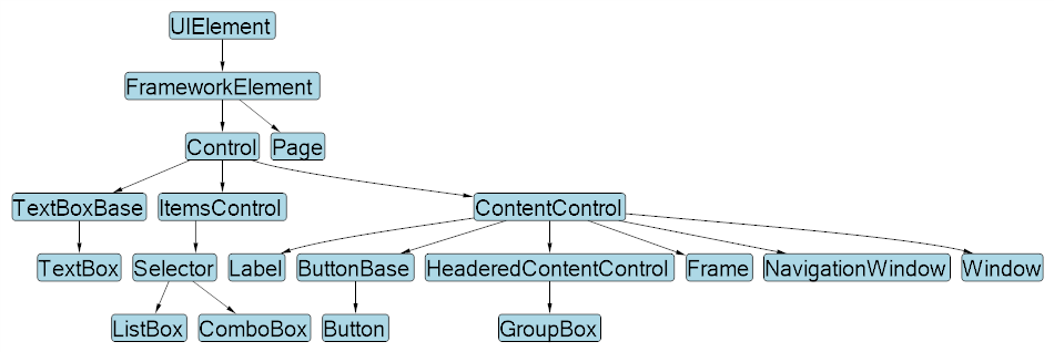
常见承载 UI 的不同根元素类型:
| 类型 | 基类 | 是否顶层 | 用途 |
|---|---|---|---|
| Window | Window | ✅ | 独立应用窗口 |
| Page | Page | ❌(需 Frame/NavigationWindow 承载) | 导航式页面 |
| NavigationWindow | NavigationWindow | ✅ | 自带导航功能的窗口 |
| Frame | ContentControl | ❌ | 页面容器,支持导航 |
| UserControl | UserControl | ❌ | 组件/控件复用 |
WPF 封装控件时如何选择父元素
- UserControl(组合控件方式)
场景:把多个现有控件组合成一个整体。
父类:
UserControl优点:
- 开发简单,直接在 XAML 里组合子控件。
- 很适合业务模块快速封装(例如:搜索框、分页组件)。
缺点:
- 样式和模板的灵活性较低,外部只能通过公开属性交互。
- 控件本身是固定的“黑盒”,外部无法替换内部布局。
适合做: 功能性组合组件(例如:带按钮的输入框)。
- 继承现有控件(扩展控件方式)
场景:在已有控件的基础上扩展功能。
父类:选择最接近目标功能的现有控件,例如:
- 基于
Button扩展成 图标按钮 - 基于
DataGrid扩展成 自定义数据表格 - 基于
ComboBox扩展成 带搜索的下拉框
- 基于
优点:
- 可以继承现有功能,减少重复代码。
- 外观和交互与原控件一致,只增加新特性。
缺点:
- 灵活性比
Control自定义控件弱。
- 灵活性比
适合做: 扩展现有控件,增加少量功能。
- Custom Control(真正的自定义控件)
场景:从零开始做一个全新的控件,或者需要支持 样式/模板替换。
父类:通常继承自
Control或者ContentControl。优点:
- 支持 ControlTemplate,完全换皮肤(如换主题)。
- 可定义 依赖属性 (DependencyProperty),支持数据绑定。
- 高度可复用,完全符合 WPF 的控件体系。
缺点:
- 开发复杂,需要写
Generic.xaml来定义默认样式。 - 学习成本高。
- 开发复杂,需要写
适合做: 企业级、框架级控件(例如:Breadcrumb 导航、专业图表控件)。
组合控件(UserControl)
示例 (自定义DataGrid):
新建->用户控件
<UserControl
    x:Class="WpfDemo.CustomControl.CustomDataGrid"
    xmlns="http://schemas.microsoft.com/winfx/2006/xaml/presentation"
    xmlns:x="http://schemas.microsoft.com/winfx/2006/xaml"
    xmlns:behaviors="clr-namespace:MaterialDesignThemes.Wpf.Behaviors;assembly=MaterialDesignThemes.Wpf"
    xmlns:converters="clr-namespace:MaterialDesignThemes.Wpf.Converters;assembly=MaterialDesignThemes.Wpf"
    xmlns:customcontrolviewmodels="clr-namespace:WpfDemo.ViewModels.CustomControlViewModels"
    xmlns:d="http://schemas.microsoft.com/expression/blend/2008"
    xmlns:internal="clr-namespace:MaterialDesignThemes.Wpf.Internal;assembly=MaterialDesignThemes.Wpf"
    xmlns:local="clr-namespace:WpfDemo.CustomControl"
    xmlns:mc="http://schemas.openxmlformats.org/markup-compatibility/2006"
    xmlns:wpf="clr-namespace:MaterialDesignThemes.Wpf;assembly=MaterialDesignThemes.Wpf"
    d:DataContext="{d:DesignInstance Type=customcontrolviewmodels:CustomDataGridViewModel}"
    d:DesignHeight="450"
    d:DesignWidth="800"
    mc:Ignorable="d">
    <!--
        ItemsSource="{Binding Items}" 默认是绑定到 DataGrid.DataContext.Items,而不是控件自身的 Items 属性。
        需要使用 RelativeSource 绑定到控件自身
    -->
    <DataGrid
        x:Name="DataGrid"
        CanUserAddRows="False"
        DataContextChanged="DataGrid_DataContextChanged"
        ItemsSource="{Binding Items, RelativeSource={RelativeSource AncestorType=UserControl}}"
        SelectionMode="Extended"
        SelectionUnit="FullRow" />
</UserControl>using System;
using System.Collections;
using System.Collections.Generic;
using System.Collections.ObjectModel;
using System.ComponentModel;
using System.ComponentModel.DataAnnotations;
using System.Diagnostics;
using System.Linq;
using System.Reflection;
using System.Windows;
using System.Windows.Controls;
using System.Windows.Data;
using Microsoft.DwayneNeed.Win32.Gdi32;
using WpfDemo.ViewModels.PageViewModels;
using static WpfDemo.Attributes.CustomDataGridAttributes;
namespace WpfDemo.CustomControl
{
public class SelectableItem<T>(T item) : INotifyPropertyChanged
{
public T Item { get; } = item;
private bool _sc_isSelected;
public bool SC_IsSelected
{
get => _sc_isSelected;
set
{
if (_sc_isSelected != value)
{
_sc_isSelected = value;
OnPropertyChanged(nameof(SC_IsSelected));
}
}
}
public event PropertyChangedEventHandler? PropertyChanged;
protected void OnPropertyChanged(string name) =>
PropertyChanged?.Invoke(this, new PropertyChangedEventArgs(name));
}
/// <summary>
/// CustomDataGrid.xaml 的交互逻辑
/// </summary>
public partial class CustomDataGrid : UserControl
{
public CustomDataGrid()
{
InitializeComponent();
}
/// <summary>
/// 定义外部数据源
/// </summary>
public static readonly DependencyProperty SourceItemsProperty = DependencyProperty.Register(
nameof(SourceItems),
typeof(IEnumerable),
typeof(CustomDataGrid),
new FrameworkPropertyMetadata(
null,
FrameworkPropertyMetadataOptions.BindsTwoWayByDefault,
OnSourceItemsChanged
)
);
public IEnumerable SourceItems
{
get => (IEnumerable)GetValue(SourceItemsProperty);
set => SetValue(SourceItemsProperty, value);
}
private static void OnSourceItemsChanged(
DependencyObject d,
DependencyPropertyChangedEventArgs e
)
{
var control = (CustomDataGrid)d;
if (e.NewValue is not IEnumerable items)
{
return;
}
control.DataGrid.AutoGenerateColumns = false;
control.DataGrid.Columns.Clear();
var itemType = GetItemType(items);
if (itemType == null)
{
return;
}
var properties = itemType.GetProperties();
if (itemType.GetCustomAttribute<EnableSelectionAttribute>()?.EnableCheckbox == true)
{
//每次失去焦点才触发
//control.DataGrid.Columns.Add(
// new DataGridCheckBoxColumn { Header = "", Binding = new Binding("IsSelected") }
//);
//修改为
var checkBoxColumn = new DataGridTemplateColumn
{
Header = "",
CellTemplate = CreateCheckBoxTemplate("SC_IsSelected"),
};
control.DataGrid.Columns.Add(checkBoxColumn);
}
foreach (var prop in properties)
{
var attr = prop.GetCustomAttribute<GridColumnAttribute>();
if (attr == null || !attr.IsVisible)
continue;
//失去了control.DataGrid.AutoGenerateColumns = true; 时的枚举类型和数字输入框的特性
//var column = new DataGridTextColumn
//{
// Header = string.IsNullOrEmpty(attr?.Label) ? prop.Name : attr.Label,
// Binding = new Binding($"Item.{prop.Name}"),
// IsReadOnly = !(attr?.IsEditable ?? false),
//};
//修改为
var column = CreateColumn(prop, attr);
control.DataGrid.Columns.Add(column);
}
var list = (IList)
Activator.CreateInstance(
typeof(List<>).MakeGenericType(
typeof(SelectableItem<>).MakeGenericType(itemType)
)
)!;
foreach (var item in items)
{
var wrapper = Activator.CreateInstance(
typeof(SelectableItem<>).MakeGenericType(itemType),
item
);
if (wrapper is INotifyPropertyChanged npc)
{
//绑定每一行的属性变化事件,捕获checkbox是否选中
npc.PropertyChanged += (sender, args) =>
{
if (args.PropertyName == "SC_IsSelected")
{
control.SelectedItems.Clear();
control
.Items.Cast<object>()
?.ToList()
.Where(i =>
{
var isCheckedProp = i.GetType().GetProperty("SC_IsSelected");
return isCheckedProp != null
&& (bool?)isCheckedProp.GetValue(i) == true;
})
?.ToList()
.ForEach(
(it) =>
{
control.SelectedItems.Add(
it.GetType().GetProperty("Item")?.GetValue(it)
);
}
);
control.RaiseEvent(new RoutedEventArgs(SelectedItemsChangedEvent));
//不能直接赋值,会中断传递
//control.SelectedItems = selected;
//control.SetCurrentValue(SelectedItemsProperty, selected);
}
};
}
list.Add(wrapper);
}
// 赋值回 Items(避免无限递归要用 SetCurrentValue 或保护递归)
control.SetCurrentValue(ItemsProperty, list);
}
private static DataTemplate CreateCheckBoxTemplate(string bindingPath)
{
string xaml =
$@"<DataTemplate xmlns='http://schemas.microsoft.com/winfx/2006/xaml/presentation'
xmlns:x='http://schemas.microsoft.com/winfx/2006/xaml'>
<CheckBox IsChecked=""{{Binding {bindingPath}, Mode=TwoWay, UpdateSourceTrigger=PropertyChanged}}""
HorizontalAlignment=""Center"" VerticalAlignment=""Center""/>
</DataTemplate>";
return (DataTemplate)System.Windows.Markup.XamlReader.Parse(xaml);
}
private static DataGridColumn CreateColumn(PropertyInfo prop, GridColumnAttribute attr)
{
var binding = new Binding($"Item.{prop.Name}")
{
UpdateSourceTrigger = UpdateSourceTrigger.PropertyChanged,
};
string header = string.IsNullOrEmpty(attr?.Label) ? prop.Name : attr.Label;
if (prop.PropertyType.IsEnum)
{
return new DataGridComboBoxColumn
{
Header = header,
SelectedItemBinding = binding,
ItemsSource = Enum.GetValues(prop.PropertyType),
IsReadOnly = !(attr?.IsEditable ?? false),
};
}
else if (prop.PropertyType == typeof(bool))
{
return new DataGridCheckBoxColumn
{
Header = header,
Binding = binding,
IsReadOnly = !(attr?.IsEditable ?? false),
};
}
else
{
return new DataGridTextColumn
{
Header = header,
Binding = binding,
IsReadOnly = !(attr?.IsEditable ?? false),
};
}
}
/// <summary>
/// 定义内部数据源
/// </summary>
public static readonly DependencyProperty ItemsProperty = DependencyProperty.Register(
nameof(Items),
typeof(IEnumerable),
typeof(CustomDataGrid),
new PropertyMetadata(null)
);
public IEnumerable Items
{
get => (IEnumerable)GetValue(ItemsProperty);
set => SetValue(ItemsProperty, value);
}
/// <summary>
/// 定义已选择数据
/// </summary>
public static readonly DependencyProperty SelectedItemsProperty =
DependencyProperty.Register(
nameof(SelectedItems),
typeof(IList),
typeof(CustomDataGrid),
new FrameworkPropertyMetadata(
null,
FrameworkPropertyMetadataOptions.BindsTwoWayByDefault
)
);
public static readonly RoutedEvent SelectedItemsChangedEvent =
EventManager.RegisterRoutedEvent(
nameof(SelectedItemsChanged),
RoutingStrategy.Bubble,
typeof(RoutedEventHandler),
typeof(CustomDataGrid)
);
public event RoutedEventHandler SelectedItemsChanged
{
add => AddHandler(SelectedItemsChangedEvent, value);
remove => RemoveHandler(SelectedItemsChangedEvent, value);
}
public IList SelectedItems
{
get => (IList)GetValue(SelectedItemsProperty);
set => SetValue(SelectedItemsProperty, value);
}
private void DataGrid_DataContextChanged(
object sender,
DependencyPropertyChangedEventArgs e
)
{
//不能在此处处理 DataGrid
//依赖属性的绑定是在 布局加载完成后逐步执行的。
//具体过程如下:
//控件加载时,XAML 引擎解析控件结构;
//设置 DataContext(触发 DataContextChanged);
//然后 ItemsSource 绑定生效 → Items 才会被赋值。
//DataContextChanged 发生时,Items 绑定还没完成
}
private static Type? GetItemType(IEnumerable items)
{
var type = items?.GetType();
if (type == null)
return null;
if (type.IsGenericType)
return type.GetGenericArguments().FirstOrDefault();
return type.GetElementType();
}
}
}调用
<UserControl
    x:Class="WpfDemo.Views.Pages.UserControlDemo"
    xmlns="http://schemas.microsoft.com/winfx/2006/xaml/presentation"
    xmlns:x="http://schemas.microsoft.com/winfx/2006/xaml"
    xmlns:customcontrol="clr-namespace:WpfDemo.CustomControl"
    xmlns:d="http://schemas.microsoft.com/expression/blend/2008"
    xmlns:local="clr-namespace:WpfDemo.Views.Pages"
    xmlns:materialDesign="http://materialdesigninxaml.net/winfx/xaml/themes"
    xmlns:mc="http://schemas.openxmlformats.org/markup-compatibility/2006"
    xmlns:viewmodels="clr-namespace:WpfDemo.ViewModels.PageViewModels"
    d:DataContext="{d:DesignInstance Type=viewmodels:UserControlDemoViewModel}"
    mc:Ignorable="d">
    <Grid>
        <StackPanel VerticalAlignment="Top" Orientation="Vertical">
            <GroupBox
                Margin="0,5"
                materialDesign:ColorZoneAssist.Background="{DynamicResource MaterialDesign.Brush.Primary.Dark}"
                materialDesign:ColorZoneAssist.Foreground="{DynamicResource MaterialDesign.Brush.Primary.Dark.Foreground}"
                materialDesign:ColorZoneAssist.Mode="Custom"
                FontSize="18"
                Header="自定义 DataGrid"
                Style="{StaticResource MaterialDesignGroupBox}">
                <StackPanel VerticalAlignment="Top" Orientation="Vertical">
                    <customcontrol:CustomDataGrid SelectedItems="{Binding SelectedUsers, Mode=TwoWay}" SourceItems="{Binding UserModels, Mode=TwoWay}" />

                    <Border
                        Margin="0,10"
                        Padding="20"
                        Background="LightGray">
                        <ListBox ItemsSource="{Binding SelectedUsers}" />
                    </Border>
                </StackPanel>

            </GroupBox>
        </StackPanel>
    </Grid>
</UserControl>
ViewModel
using System.Collections.ObjectModel;
using CommunityToolkit.Mvvm.ComponentModel;
using CommunityToolkit.Mvvm.Input;
using WpfDemo.Services;

namespace WpfDemo.ViewModels.PageViewModels
{
    public partial class UserControlDemoViewModel(UserControlDemoService service) : ViewModelBase
    {
        private readonly UserControlDemoService _service = service;

        [ObservableProperty]
        private ObservableCollection<UserModel> userModels =
        [
            new UserModel
            {
                Name = "张三",
                Age = 16,
                Gender = Gender.Male,
            },
            new UserModel
            {
                Name = "李四",
                Age = 17,
                Gender = Gender.Female,
            },
            new UserModel
            {
                Name = "王五",
                Age = 18,
                Gender = Gender.Male,
            },
            new UserModel
            {
                Name = "刘六",
                Age = 19,
                Gender = Gender.Female,
            },
        ];

        [ObservableProperty]
        private ObservableCollection<UserModel> selectedUsers = [];
    }
}
扩展控件(基于现有控件)
示例(扩展按钮右击事件)
新建->自定义控件
using System;
using System.Collections.Generic;
using System.Linq;
using System.Text;
using System.Threading.Tasks;
using System.Windows;
using System.Windows.Controls;
using System.Windows.Data;
using System.Windows.Documents;
using System.Windows.Input;
using System.Windows.Media;
using System.Windows.Media.Imaging;
using System.Windows.Navigation;
using System.Windows.Shapes;

namespace WpfCustomControlLibrary
{
    /// <summary>
    /// 按照步骤 1a 或 1b 操作,然后执行步骤 2 以在 XAML 文件中使用此自定义控件。
    ///
    /// 步骤 1a) 在当前项目中存在的 XAML 文件中使用该自定义控件。
    /// 将此 XmlNamespace 特性添加到要使用该特性的标记文件的根
    /// 元素中:
    ///
    ///     xmlns:MyNamespace="clr-namespace:WpfCustomControlLibrary"
    ///
    ///
    /// 步骤 1b) 在其他项目中存在的 XAML 文件中使用该自定义控件。
    /// 将此 XmlNamespace 特性添加到要使用该特性的标记文件的根
    /// 元素中:
    ///
    ///     xmlns:MyNamespace="clr-namespace:WpfCustomControlLibrary;assembly=WpfCustomControlLibrary"
    ///
    /// 您还需要添加一个从 XAML 文件所在的项目到此项目的项目引用,
    /// 并重新生成以避免编译错误:
    ///
    ///     在解决方案资源管理器中右击目标项目,然后依次单击
    ///     “添加引用”->“项目”->[浏览查找并选择此项目]
    ///
    ///
    /// 步骤 2)
    /// 继续操作并在 XAML 文件中使用控件。
    ///
    ///     <MyNamespace:CustomButton/>
    ///
    /// </summary>
    public class CustomButton : Button
    {
        public static readonly RoutedEvent MyClickEvent = EventManager.RegisterRoutedEvent(
            "MyClick", // 事件名称
            RoutingStrategy.Bubble, // 路由策略(可以是 Bubble、Tunnel 或 Direct)
            typeof(RoutedEventHandler), // 事件处理器类型
            typeof(CustomButton)
        ); // 所属类型

        static CustomButton()
        {
            DefaultStyleKeyProperty.OverrideMetadata(
                typeof(CustomButton),
                //使用Button默认样式
                new FrameworkPropertyMetadata(typeof(Button))
            );
        }

        // CLR事件包装器
        public event RoutedEventHandler MyClick
        {
            add { AddHandler(MyClickEvent, value); }
            remove { RemoveHandler(MyClickEvent, value); }
        }

        // 方法:触发事件
        protected void RaiseMyClickEvent()
        {
            RoutedEventArgs args = new(MyClickEvent);
            RaiseEvent(args);
        }

        // 示例:右键点击控件时触发事件
        protected override void OnMouseRightButtonDown(MouseButtonEventArgs e)
        {
            base.OnMouseLeftButtonDown(e);
            RaiseMyClickEvent();
        }
    }
}
调用:
<UserControl
    x:Class="WpfDemo.Views.Pages.ExtendedControlDemo"
    xmlns="http://schemas.microsoft.com/winfx/2006/xaml/presentation"
    xmlns:x="http://schemas.microsoft.com/winfx/2006/xaml"
    xmlns:customcontrol="clr-namespace:WpfDemo.CustomControl"
    xmlns:customcontrollibrary="clr-namespace:WpfCustomControlLibrary;assembly=WpfCustomControlLibrary"
    xmlns:d="http://schemas.microsoft.com/expression/blend/2008"
    xmlns:local="clr-namespace:WpfDemo.Views.Pages"
    xmlns:materialDesign="http://materialdesigninxaml.net/winfx/xaml/themes"
    xmlns:mc="http://schemas.openxmlformats.org/markup-compatibility/2006"
    xmlns:viewmodels="clr-namespace:WpfDemo.ViewModels.PageViewModels"
    d:DataContext="{d:DesignInstance Type=viewmodels:ExtendedControlDemoViewModel}"
    mc:Ignorable="d">
    <Grid>
        <StackPanel VerticalAlignment="Top" Orientation="Vertical">
            <GroupBox
                Margin="0,5"
                materialDesign:ColorZoneAssist.Background="{DynamicResource MaterialDesign.Brush.Primary.Dark}"
                materialDesign:ColorZoneAssist.Foreground="{DynamicResource MaterialDesign.Brush.Primary.Dark.Foreground}"
                materialDesign:ColorZoneAssist.Mode="Custom"
                FontSize="18"
                Header="按钮扩展"
                Style="{StaticResource MaterialDesignGroupBox}">
                <StackPanel VerticalAlignment="Top" Orientation="Vertical">
                    <customcontrollibrary:CustomButton
                        Width="300"
                        Click="CustomButton_Click"
                        Content="自定义按钮(右击触发)"
                        MyClick="MyCustomControl_MyClick"
                        Style="{StaticResource MaterialDesignRaisedDarkButton}" />

                </StackPanel>

            </GroupBox>
        </StackPanel>
    </Grid>
</UserControl>using System.Windows;
using System.Windows.Controls;
using WpfDemo.Services;
using WpfDemo.ViewModels.PageViewModels;
namespace WpfDemo.Views.Pages
{
/// <summary>
/// ExtendedControlDemo.xaml 的交互逻辑
/// </ExtendedControlDemo>
public partial class ExtendedControlDemo : UserControl
{
public ExtendedControlDemo()
{
InitializeComponent();
}
private async void MyCustomControl_MyClick(object sender, RoutedEventArgs e)
{
await GlobalNotifier.ShowInfoDialog("右键触发", "按钮事件");
}
private async void CustomButton_Click(object sender, RoutedEventArgs e)
{
await GlobalNotifier.ShowInfoDialog("左键触发", "按钮事件");
}
}
}自定义控件(CustomControl)
示例(面包屑):
推荐目录
CustomControlLibrary
-- Themes (样式默认路径)
  |-- Generic.xaml (关联Breadcrumb.xaml)
  |-- Breadcrumb.xaml
-- Breadcrumb.cs
Breadcrumb.cs
using System.Collections;
using System.Text;
using System.Windows;
using System.Windows.Controls;
using System.Windows.Data;
using System.Windows.Documents;
using System.Windows.Input;
using System.Windows.Media;
using System.Windows.Media.Imaging;
using System.Windows.Navigation;
using System.Windows.Shapes;

namespace WpfCustomControlLibrary
{
    /// <summary>
    /// Follow steps 1a or 1b and then 2 to use this custom control in a XAML file.
    ///
    /// Step 1a) Using this custom control in a XAML file that exists in the current project.
    /// Add this XmlNamespace attribute to the root element of the markup file where it is
    /// to be used:
    ///
    ///     xmlns:MyNamespace="clr-namespace:WpfCustomControlLibrary"
    ///
    ///
    /// Step 1b) Using this custom control in a XAML file that exists in a different project.
    /// Add this XmlNamespace attribute to the root element of the markup file where it is
    /// to be used:
    ///
    ///     xmlns:MyNamespace="clr-namespace:WpfCustomControlLibrary;assembly=WpfCustomControlLibrary"
    ///
    /// You will also need to add a project reference from the project where the XAML file lives
    /// to this project and Rebuild to avoid compilation errors:
    ///
    ///     Right click on the target project in the Solution Explorer and
    ///     "Add Reference"->"Projects"->[Select this project]
    ///
    ///
    /// Step 2)
    /// Go ahead and use your control in the XAML file.
    ///
    ///     <MyNamespace:Breadcrumb/>
    ///
    /// </summary>
    public class Breadcrumb : ItemsControl
    {
        static Breadcrumb()
        {
            DefaultStyleKeyProperty.OverrideMetadata(typeof(Breadcrumb), new FrameworkPropertyMetadata(typeof(Breadcrumb)));
        }

        public static readonly DependencyProperty SeparatorProperty =
                DependencyProperty.Register("Separator", typeof(object), typeof(Breadcrumb), new PropertyMetadata("/"));

        public object Separator
        {
            get => GetValue(SeparatorProperty);
            set => SetValue(SeparatorProperty, value);
        }

        protected override bool IsItemItsOwnContainerOverride(object item)
        {
            return item is BreadcrumbItem;
        }

        protected override DependencyObject GetContainerForItemOverride()
        {
            return new BreadcrumbItem();
        }
    }

    public class BreadcrumbItem : ContentControl
    {
        static BreadcrumbItem()
        {
            DefaultStyleKeyProperty.OverrideMetadata(typeof(BreadcrumbItem),
                new FrameworkPropertyMetadata(typeof(BreadcrumbItem)));
        }

        //Breadcrumb使用 <Setter Property="ItemContainerStyle"> 传递
        public static readonly DependencyProperty SeparatorProperty =
            DependencyProperty.Register(nameof(Separator), typeof(object), typeof(BreadcrumbItem));

        public object Separator
        {
            get => GetValue(SeparatorProperty);
            set => SetValue(SeparatorProperty, value);
        }

        public static readonly DependencyProperty IconProperty =
            DependencyProperty.Register("Icon", typeof(object), typeof(BreadcrumbItem));

        public object Icon
        {
            get => GetValue(IconProperty);
            set => SetValue(IconProperty, value);
        }

        public static readonly DependencyProperty CommandProperty =
            DependencyProperty.Register("Command", typeof(ICommand), typeof(BreadcrumbItem));

        public ICommand Command
        {
            get => (ICommand)GetValue(CommandProperty);
            set => SetValue(CommandProperty, value);
        }

        public static readonly DependencyProperty LabelProperty =
            DependencyProperty.Register("Label", typeof(object), typeof(BreadcrumbItem));

        public object Label
        {
            get => GetValue(LabelProperty);
            set => SetValue(LabelProperty, value);
        }

    }
}
Breadcrumb.xaml
<ResourceDictionary
    xmlns="http://schemas.microsoft.com/winfx/2006/xaml/presentation"
    xmlns:x="http://schemas.microsoft.com/winfx/2006/xaml"
    xmlns:converters="clr-namespace:WpfCustomControlLibrary.Converters"
    xmlns:local="clr-namespace:WpfCustomControlLibrary">

    <ResourceDictionary.MergedDictionaries>
        <ResourceDictionary Source="pack://application:,,,/MaterialDesignThemes.Wpf;component/Themes/MaterialDesignTheme.Button.xaml" />
    </ResourceDictionary.MergedDictionaries>

    <Style TargetType="{x:Type local:Breadcrumb}">

        <Setter Property="Template">
            <Setter.Value>
                <ControlTemplate TargetType="{x:Type local:Breadcrumb}">
                    <ItemsPresenter />
                </ControlTemplate>
            </Setter.Value>
        </Setter>
        <Setter Property="ItemsPanel">
            <Setter.Value>
                <ItemsPanelTemplate>
                    <StackPanel Orientation="Horizontal" />
                </ItemsPanelTemplate>
            </Setter.Value>
        </Setter>
        <!--<Setter Property="ItemTemplate">
            <Setter.Value>
                <DataTemplate>
                    <StackPanel VerticalAlignment="Center" Orientation="Horizontal">
                        <local:BreadcrumbItem Label="{Binding Label}" />
                    </StackPanel>
                </DataTemplate>
            </Setter.Value>
        </Setter>-->
        <Setter Property="ItemContainerStyle">
            <Setter.Value>
                <!--  透传Separator  -->
                <Style TargetType="{x:Type local:BreadcrumbItem}">
                    <Setter Property="Separator" Value="{Binding Path=Separator, RelativeSource={RelativeSource AncestorType={x:Type local:Breadcrumb}}}" />
                </Style>
            </Setter.Value>
        </Setter>
    </Style>

    <Style TargetType="{x:Type local:BreadcrumbItem}">
        <Setter Property="Template">
            <Setter.Value>
                <ControlTemplate TargetType="{x:Type local:BreadcrumbItem}">
                    <StackPanel Orientation="Horizontal">
                        <Grid>
                            <Grid.ColumnDefinitions>
                                <ColumnDefinition Width="16" />
                                <ColumnDefinition Width="*" />
                            </Grid.ColumnDefinitions>
                            <StackPanel VerticalAlignment="Center" Orientation="Vertical">
                                <TextBlock
                                    Grid.Column="0"
                                    Height="auto"
                                    FontSize="16"
                                    Text="{TemplateBinding Separator}" />
                            </StackPanel>
                            <Button
                                Grid.Column="1"
                                Padding="6,0"
                                VerticalAlignment="Center"
                                AutomationProperties.Name="BreadcrumbItem"
                                Background="Transparent"
                                BorderThickness="0"
                                Command="{Binding Command}"
                                Content="{Binding Label}"
                                FontSize="16"
                                FontWeight="Normal"
                                Style="{StaticResource MaterialDesignPaperLightButton}" />
                        </Grid>
                    </StackPanel>
                </ControlTemplate>
            </Setter.Value>
        </Setter>
    </Style>

</ResourceDictionary>
必要元素
- ItemsPresenter 必须存在:否则 ItemsControl 不会显示子项。
- ItemsPanel 可自定义:比如 StackPanel、WrapPanel、UniformGrid。
- ItemTemplate 可由使用者指定:你可以在 XAML 里绑定数据模板。如果没有ItemTemplate,会按照Item的模板,每个Item生成一个。
调用:
<UserControl
x:Class="WpfDemo.Views.Pages.CustomControlDemo"
xmlns="http://schemas.microsoft.com/winfx/2006/xaml/presentation"
xmlns:x="http://schemas.microsoft.com/winfx/2006/xaml"
xmlns:customcontrollibrary="clr-namespace:WpfCustomControlLibrary;assembly=WpfCustomControlLibrary"
xmlns:d="http://schemas.microsoft.com/expression/blend/2008"
xmlns:local="clr-namespace:WpfDemo.Views.Pages"
xmlns:materialDesign="http://materialdesigninxaml.net/winfx/xaml/themes"
xmlns:mc="http://schemas.openxmlformats.org/markup-compatibility/2006"
xmlns:viewmodels="clr-namespace:WpfDemo.ViewModels.PageViewModels"
d:DataContext="{d:DesignInstance Type=viewmodels:CustomControlDemoViewModel}"
mc:Ignorable="d">
<Grid>
<StackPanel VerticalAlignment="Top" Orientation="Vertical">
<GroupBox
Margin="0,5"
materialDesign:ColorZoneAssist.Background="{DynamicResource MaterialDesign.Brush.Primary.Dark}"
materialDesign:ColorZoneAssist.Foreground="{DynamicResource MaterialDesign.Brush.Primary.Dark.Foreground}"
materialDesign:ColorZoneAssist.Mode="Custom"
FontSize="18"
Header="面包屑"
Style="{StaticResource MaterialDesignGroupBox}">
<StackPanel VerticalAlignment="Top" Orientation="Vertical">
<customcontrollibrary:Breadcrumb
Grid.Row="0"
Grid.Column="0"
Margin="20,0,0,0"
ItemsSource="{Binding Breadcrumb}"
Separator=">" />
</StackPanel>
</GroupBox>
</StackPanel>
</Grid>
</UserControl>using System.Collections.ObjectModel;
using CommunityToolkit.Mvvm.ComponentModel;
using WpfDemo.Models;
using WpfDemo.Services;
namespace WpfDemo.ViewModels.PageViewModels
{
public partial class CustomControlDemoViewModel(CustomControlDemoService service)
: ViewModelBase
{
private readonly CustomControlDemoService _service = service;
[ObservableProperty]
private ObservableCollection<BreadcrumbItem> _breadcrumb =
[
new BreadcrumbItem { Label = "标题1" },
new BreadcrumbItem { Label = "标题2" },
new BreadcrumbItem { Label = "标题3" },
new BreadcrumbItem { Label = "标题4" },
new BreadcrumbItem { Label = "标题5" },
];
}
}数据处理(data)
系统配置文件
App.config
危险
- 修改的是 运行目录下的 exe.config,不建议频繁写入;
- 若需要存储用户个性化配置,推荐 Properties.Settings 或 JSON 文件。
示例:
//读
AppConfigRead = ConfigurationManager.AppSettings["AppSettingTest"];
//写
ConfigurationManager.AppSettings["AppSettingTest"] = AppConfigWrite;
Settings.settings
在项目 → 属性 → Settings.settings 中可以定义配置项。
提示
这种方式自动存储在: C:\Users\<用户名>\AppData\Local\<公司名>\<应用名>_<随机串>\<版本>\user.config
示例:
//读
SettingConfigRead = Properties.Settings.Default.SettingTest;
//写
Properties.Settings.Default.SettingTest = SettingConfigWrite;
Properties.Settings.Default.Save();
文件存储
示例:
public class AppConfig
{
    public string AppConfigItem1 { get; set; } = "AppConfigItem1";
    public string AppConfigItem2 { get; set; } = "AppConfigItem2";
}

public static class ConfigHelper
{
    //漫游用户路径
    private readonly static string configPath = Path.Combine(
        Environment.GetFolderPath(Environment.SpecialFolder.ApplicationData),
        "WPFDemo",
        "config.json"
    )

    public static AppConfig LoadConfig()
    {
        if (!File.Exists(configPath))
            return new AppConfig();

        var json = File.ReadAllText(configPath);
        return JsonSerializer.Deserialize<AppConfig>(json) ?? new AppConfig();
    }

    //对于 典型 WPF 配置文件(几 KB),当前实现不会有性能问题
    public static void SaveConfig(AppConfig? config)
    {
        if (config == null)
        {
            return;
        }
        Directory.CreateDirectory(Path.GetDirectoryName(configPath)!);
        var json = JsonSerializer.Serialize(
            config,
            new JsonSerializerOptions { WriteIndented = true }
        );
        File.WriteAllText(configPath, json);
    }
}
数据库存储
嵌入式数据库
嵌入式数据库 以
SQL Lite为例, 一般作为本地数据库,开发时不需要单独安装。
示例:
using System;
using System.Collections.Generic;
using System.Collections.ObjectModel;
using System.Data;
using System.IO;
using System.Linq;
using System.Reflection;
using System.Text;
using System.Threading.Tasks;
using Microsoft.Data.Sqlite;
using SQLitePCL;
using WpfDemo.ViewModels.PageViewModels;
using static WpfDemo.Attributes.CustomDataGridAttributes;

namespace WpfDemo.SqlLite
{
    public class SqliteHelper
    {
        private static readonly Lazy<SqliteHelper> _instance = new(() => new SqliteHelper());

        private readonly string _connectionString;

        private static readonly string _dbPath = Path.Combine(
            Environment.GetFolderPath(Environment.SpecialFolder.ApplicationData),
            "WPFDemo",
            "mydb.sqlite"
        );

        //private static readonly string _dbPath = "mydb.sqlite";

        private SqliteHelper()
        {
            _connectionString = $"Data Source={_dbPath};Cache=Shared;";
            Batteries.Init();
            // 如果数据库文件不存在,可以在这里自动创建表
            InitTable();
        }

        /// <summary>
        /// 单例懒加载,切记connection不能复用,会出现脏读脏写
        /// </summary>
        public static SqliteHelper Instance => _instance.Value;

        /// <summary>
        /// 初始化应用程序的数据库白哦
        /// </summary>
        private void InitTable()
        {
            ExecuteNonQuery(
                @"CREATE TABLE IF NOT EXISTS Users (
                            Id INTEGER PRIMARY KEY AUTOINCREMENT,
                            Name TEXT NOT NULL,
                            Gender INTEGER NOT NULL,
                            Age INTEGER)"
            );
        }

        /// <summary>
        /// 执行非查询 SQL (增删改)
        /// 事务避免脏写
        /// </summary>
        public int ExecuteNonQuery(string sql, params SqliteParameter[] parameters)
        {
            using var conn = new SqliteConnection(_connectionString);
            conn.Open();

            using var tran = conn.BeginTransaction();
            try
            {
                using var cmd = new SqliteCommand(sql, conn, tran);
                if (parameters != null)
                    cmd.Parameters.AddRange(parameters);
                return cmd.ExecuteNonQuery();
            }
            catch
            {
                tran.Rollback();
                throw;
            }
        }

        /// <summary>
        /// 执行查询 SQL,返回 DataTable
        /// </summary>
        public DataTable ExecuteQuery(string sql, params SqliteParameter[] parameters)
        {
            var dt = new DataTable();

            using var conn = new SqliteConnection(_connectionString);
            conn.Open();

            using var cmd = new SqliteCommand(sql, conn);
            if (parameters != null)
                cmd.Parameters.AddRange(parameters);

            using var reader = cmd.ExecuteReader();
            dt.Load(reader);
            return dt;
        }

        /// <summary>
        /// 执行查询 SQL,返回单个值
        /// </summary>
        public object ExecuteScalar(string sql, params SqliteParameter[] parameters)
        {
            using var conn = new SqliteConnection(_connectionString);
            conn.Open();
            using var cmd = new SqliteCommand(sql, conn);
            if (parameters != null)
                cmd.Parameters.AddRange(parameters);
            return cmd.ExecuteScalar()!;
        }
    }

    public static class DataTableExtensions
    {
        public static List<T> ToEntityList<T>(this DataTable table)
            where T : new()
        {
            var properties = typeof(T).GetProperties();
            var list = new List<T>();

            foreach (DataRow row in table.Rows)
            {
                var entity = new T();

                foreach (var prop in properties)
                {
                    if (table.Columns.Contains(prop.Name) && row[prop.Name] != DBNull.Value)
                    {
                        var attr = prop.GetCustomAttribute<GridColumnAttribute>();
                        if (attr?.Type != null)
                        {
                            prop.SetValue(entity, Enum.ToObject(attr.Type, row[prop.Name]));
                            continue;
                        }
                        prop.SetValue(
                            entity,
                            Convert.ChangeType(row[prop.Name], prop.PropertyType)
                        );
                    }
                }

                list.Add(entity);
            }

            return list;
        }
    }

    public static class CollectionExtensions
    {
        public static ObservableCollection<T> ToObservableCollection<T>(this IEnumerable<T> source)
        {
            return new ObservableCollection<T>(source);
        }
    }
}
使用:
ViewMdoel
using System.Collections.ObjectModel;
using CommunityToolkit.Mvvm.ComponentModel;
using CommunityToolkit.Mvvm.Input;
using Microsoft.VisualBasic.ApplicationServices;
using WpfDemo.Services;
using WpfDemo.SqlLite;

namespace WpfDemo.ViewModels.PageViewModels
{
    public partial class DatabaseStorageViewModel : ViewModelBase
    {
        private readonly DatabaseStorageService _service;

        public DatabaseStorageViewModel(DatabaseStorageService service)
        {
            _service = service;
            Refresh();
        }

        [ObservableProperty]
        private ObservableCollection<UserModel> userModels = [];

        [RelayCommand]
        private void Refresh()
        {
            UserModels =
                SqliteHelper
                    .Instance.ExecuteQuery("SELECT * FROM Users;")
                    .ToEntityList<UserModel>()
                    .Select(user =>
                    {
                        user.PropertyChanged += User_PropertyChanged;
                        return user;
                    })
                    .ToObservableCollection() ?? [];
        }

        private void User_PropertyChanged(
            object? sender,
            System.ComponentModel.PropertyChangedEventArgs e
        )
        {
            if (sender is UserModel user)
            {
                SqliteHelper.Instance.ExecuteQuery(
                    $"UPDATE Users SET Name = '{user.Name}', Age = {user.Age}, Gender = {(int)user.Gender} WHERE ID = {user.Id}"
                );
            }
        }

        [ObservableProperty]
        private ObservableCollection<UserModel> selectedUsers = [];

        [ObservableProperty]
        private UserModel createdModel = new();

        [RelayCommand]
        private void AddUserEntity(UserModel createdModel)
        {
            SqliteHelper.Instance.ExecuteQuery(
                $"INSERT INTO Users (Name, Age, Gender) VALUES (' {createdModel.Name}', {createdModel.Age}, '{(int)createdModel.Gender}');"
            );
            Refresh();
        }

        [RelayCommand]
        private async Task AddUser()
        {
            await GlobalNotifier.ShowForm(CreatedModel, AddUserEntityCommand);
        }

        [RelayCommand]
        private void DeleteUsers()
        {
            if (SelectedUsers.Count > 0)
            {
                SqliteHelper.Instance.ExecuteQuery(
                    string.Join(
                        "",
                        SelectedUsers.Select(s => $"DELETE FROM Users WHERE Id = {s.Id};")
                    )
                );
                Refresh();
            }
        }
    }
}
View
<UserControl
    x:Class="WpfDemo.Views.Pages.DatabaseStorage"
    xmlns="http://schemas.microsoft.com/winfx/2006/xaml/presentation"
    xmlns:x="http://schemas.microsoft.com/winfx/2006/xaml"
    xmlns:customcontrol="clr-namespace:WpfDemo.CustomControl"
    xmlns:d="http://schemas.microsoft.com/expression/blend/2008"
    xmlns:local="clr-namespace:WpfDemo.Views.Pages"
    xmlns:materialDesign="http://materialdesigninxaml.net/winfx/xaml/themes"
    xmlns:mc="http://schemas.openxmlformats.org/markup-compatibility/2006"
    xmlns:viewmodels="clr-namespace:WpfDemo.ViewModels.PageViewModels"
    d:DataContext="{d:DesignInstance Type=viewmodels:DatabaseStorageViewModel}"
    mc:Ignorable="d">
    <Grid>
        <StackPanel VerticalAlignment="Top" Orientation="Vertical">

            <GroupBox
                Margin="0,10"
                materialDesign:ColorZoneAssist.Background="{DynamicResource MaterialDesign.Brush.Primary.Dark}"
                materialDesign:ColorZoneAssist.Foreground="{DynamicResource MaterialDesign.Brush.Primary.Dark.Foreground}"
                materialDesign:ColorZoneAssist.Mode="Custom"
                FontSize="18"
                Header="Sqlite"
                Style="{StaticResource MaterialDesignGroupBox}">
                <StackPanel
                    Width="800"
                    VerticalAlignment="Top"
                    Orientation="Vertical">
                    <StackPanel HorizontalAlignment="Left" Orientation="Horizontal">
                        <Button
                            Margin="10"
                            Command="{Binding AddUserCommand}"
                            Content="新增"
                            Style="{StaticResource MaterialDesignFlatDarkBgButton}" />
                        <Button
                            Margin="10"
                            Background="DarkRed"
                            Command="{Binding DeleteUsersCommand}"
                            Content="删除"
                            Style="{StaticResource MaterialDesignFlatDarkBgButton}" />
                        <Button
                            Margin="10"
                            Background="DarkSeaGreen"
                            BorderBrush="DarkGreen"
                            Command="{Binding RefreshCommand}"
                            Content="刷新"
                            Style="{StaticResource MaterialDesignFlatDarkBgButton}" />
                    </StackPanel>

                    <customcontrol:CustomDataGrid SelectedItems="{Binding SelectedUsers, Mode=TwoWay}" SourceItems="{Binding UserModels, Mode=TwoWay}" />
                </StackPanel>
            </GroupBox>
        </StackPanel>
    </Grid>
</UserControl>
Mysql/Sqlserver
注意
- 一般情况下,WPF应用不会访问本地数据库。
- 即使需要访问非嵌入式数据库,一般也需要配置远程数据源,参考 Web后端-EF Core
- 处理复杂数据最常见的方式是使用Http请求远程访问服务端数据。
应用数据存储(ApplicationData)
在 WPF 桌面应用里,ApplicationData 通常指 Windows 提供的应用数据存储目录(用户级或系统级),主要用来存储 配置文件、缓存、用户数据。这样做的好处是:
- 路径规范,符合 Windows 用户习惯;
- 不需要管理员权限;
- 不同用户隔离,互不影响。
在 .NET 中可以通过 Environment.GetFolderPath 获取:
// 当前用户的应用数据(Roaming,可随用户漫游到域内其他电脑)
string roamingPath = Environment.GetFolderPath(Environment.SpecialFolder.ApplicationData);

// 当前用户的本地应用数据(Local,仅保存在本机)
string localPath = Environment.GetFolderPath(Environment.SpecialFolder.LocalApplicationData);

// 所有用户共享的应用数据
string commonPath = Environment.GetFolderPath(Environment.SpecialFolder.CommonApplicationData);
路径示例:
- Roaming:C:\Users<用户名>\AppData\Roaming
- Local:C:\Users<用户名>\AppData\Local
- Common:C:\ProgramData
Http请求
示例:
using System;
using System.Collections.Generic;
using System.Linq;
using System.Net.Http;
using System.Net.Http.Headers;
using System.Text;
using System.Threading.Tasks;
using Newtonsoft.Json;

namespace WpfDemo.Services
{
    public static class HttpHelper
    {
        /// <summary>
        /// 单例 HttpClient(推荐做法,避免频繁创建)
        ///
        /// 为什么 HttpClient 可以全局复用?
        /// 1. 线程安全
        ///     HttpClient 的 方法(GetAsync、PostAsync 等)是线程安全的。
        ///     内部用了连接池(SocketsHttpHandler),多个线程同时调用是没问题的。
        /// 2. 避免 Socket 耗尽
        ///     如果每次请求都用 new HttpClient(),请求完成后就释放,会导致端口(TIME_WAIT)堆积,尤其是高并发时。
        ///     单例/长生命周期的 HttpClient 会自动复用 TCP 连接,性能更好。
        /// </summary>
        private static readonly HttpClient _httpClient = new()
        {
            Timeout = TimeSpan.FromSeconds(30), // 默认超时 30s
        };

        #region GET
        public static async Task<(bool isSuccess, T? result, string? error)> GetAsync<T>(
            string url,
            string? token = null
        )
        {
            try
            {
                var request = new HttpRequestMessage(HttpMethod.Get, url);
                if (!string.IsNullOrWhiteSpace(token))
                    request.Headers.Authorization = new AuthenticationHeaderValue("Bearer", token);

                var response = await _httpClient.SendAsync(request);
                response.EnsureSuccessStatusCode();

                var json = await response.Content.ReadAsStringAsync();
                var result = JsonConvert.DeserializeObject<T>(json);
                return (true, result, null);
            }
            catch (Exception ex)
            {
                return (false, default, ex.Message);
            }
        }
        #endregion

        #region POST
        public static async Task<(bool isSuccess, T? result, string? error)> PostAsync<T>(
            string url,
            object data,
            string? token = null
        )
        {
            try
            {
                var json = JsonConvert.SerializeObject(data);
                var content = new StringContent(json, Encoding.UTF8, "application/json");

                var request = new HttpRequestMessage(HttpMethod.Post, url) { Content = content };
                if (!string.IsNullOrWhiteSpace(token))
                    request.Headers.Authorization = new AuthenticationHeaderValue("Bearer", token);

                var response = await _httpClient.SendAsync(request);
                response.EnsureSuccessStatusCode();

                var resultJson = await response.Content.ReadAsStringAsync();
                var result = JsonConvert.DeserializeObject<T>(resultJson);
                return (true, result, null);
            }
            catch (Exception ex)
            {
                return (false, default, ex.Message);
            }
        }
        #endregion

        #region PUT
        public static async Task<(bool isSuccess, T? result, string? error)> PutAsync<T>(
            string url,
            object data,
            string? token = null
        )
        {
            try
            {
                var json = JsonConvert.SerializeObject(data);
                var content = new StringContent(json, Encoding.UTF8, "application/json");

                var request = new HttpRequestMessage(HttpMethod.Put, url) { Content = content };
                if (!string.IsNullOrWhiteSpace(token))
                    request.Headers.Authorization = new AuthenticationHeaderValue("Bearer", token);

                var response = await _httpClient.SendAsync(request);
                response.EnsureSuccessStatusCode();

                var resultJson = await response.Content.ReadAsStringAsync();
                var result = JsonConvert.DeserializeObject<T>(resultJson);
                return (true, result, null);
            }
            catch (Exception ex)
            {
                return (false, default, ex.Message);
            }
        }
        #endregion

        #region DELETE
        public static async Task<(bool isSuccess, string? error)> DeleteAsync(
            string url,
            string? token = null
        )
        {
            try
            {
                var request = new HttpRequestMessage(HttpMethod.Delete, url);
                if (!string.IsNullOrWhiteSpace(token))
                    request.Headers.Authorization = new AuthenticationHeaderValue("Bearer", token);

                var response = await _httpClient.SendAsync(request);
                response.EnsureSuccessStatusCode();
                return (true, null);
            }
            catch (Exception ex)
            {
                return (false, ex.Message);
            }
        }
        #endregion
    }
}